Zhuoqun Yuan
Jun 1, 2025

Finora
This is a dashboard design created for a SaaS company with multinational operations.
Industry
FinTech
Responsibility
End-to-end Designer
Duration
8 Weeks
About Finora
Finora Global Solutions is a mid-sized SaaS company headquartered in London, operating across Europe, North America, and Asia.
While providing subscription-based services to its clients, Finora itself faces complex challenges managing multi-currency operations and fragmented financial data across regions.
The goal of this project is to design an internal financial dashboard that consolidates data, provides real-time insights, supports predictive forecasting, and ensures compliance through transparent audit trails — enabling finance teams to make faster, more confident, data-driven decisions.
Problems & Goal Statement
Key challenges faced by Finora’s global finance team


Fragmented Data
Different regions use separate tools and spreadsheets.

Delayed Reports
Monthly reports take 2+ weeks to compile manually.

Currency Fluctuations
Forecasts become unreliable across changing exchange rates.

Low Transparency
No unified dashboard for real-time visibility.
Design Goals for Finora’s Financial Dashboard
Centralized
Data Integration
Unify regional systems and enable real-time multi-currency overview.


Automated
Reconciliation
Reduce manual workload and errors through automation.

Predictive
Insights
Anticipate risks via data-driven forecasting.

Transparent
Compliance
Build trust through clear audit trails and access control.
Design Process
I followed a human-centered design process, moving through the five steps.
Empathize
Define
Ideate
Prototype
Test
User Persona
I conducted secondary research on enterprise SaaS dashboards and finance workflows.
and created 2 main personas by AI skills to represent Finora’s internal finance team across hierarchical roles in order to empathize and understand the Finance Team better.
Persona1 James Whitmore
Persona2 Li Na
Empathy Map
I used this empathy map to translate research findings into a clear understanding of users’ needs, motivations, and emotions.
James Whitmore
Chief Financial Officerr

Says
“We’re always late to know our real financial position.”

Thinks
A centralized dashboard would enable quicker, smarter decisions.
Does
Regularly pushes teams for faster, more accurate reports.
Feels
Pressured and anxious about delayed, unreliable data.
Li Na
Regional Finance Manager
Says
“I need to track budgets and exchange rates in real time.”

Thinks
Automated dual-currency reporting would eliminate confusion.
Does
Spends hours manually reconciling regional and HQ spreadsheets.
Feels
Frustrated by repetitive manual work yet eager for more reliable tools.
Key Insights
I distilled research findings into key insights to clearly define the core problems faced by finance teams.
1
Finance teams lack real-time data visibility across regions.
2
Reporting delays cause decision-making lags of up to two weeks.
3
Manual reconciliation increases risk of error and stress.
4
No unified KPI framework; data definitions differ between teams.
Affinity Map
I synthesized insights from user interviews and secondary research by creating an affinity map, grouping key pain points and needs into thematic clusters to reveal patterns and inform dashboard redesign priorities.
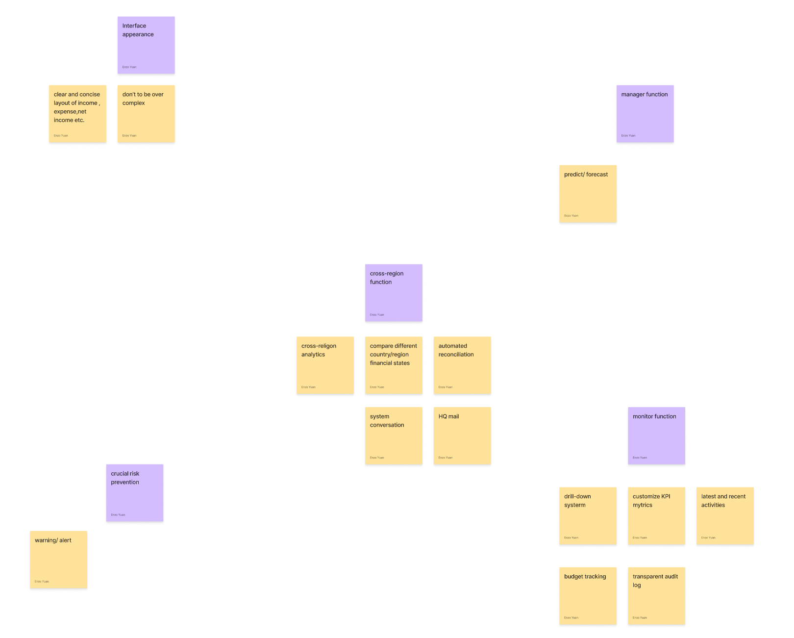
Information Architecture
I created a structured information architecture that organizes the dashboard into core sections with consistent navigation and tailored content, ensuring intuitive access to financial insights while incorporating an onboarding flow.

welcome page
Onboarding


Dashboard
Global Header
Sidebar Navigation
Right Sidebar Widgets
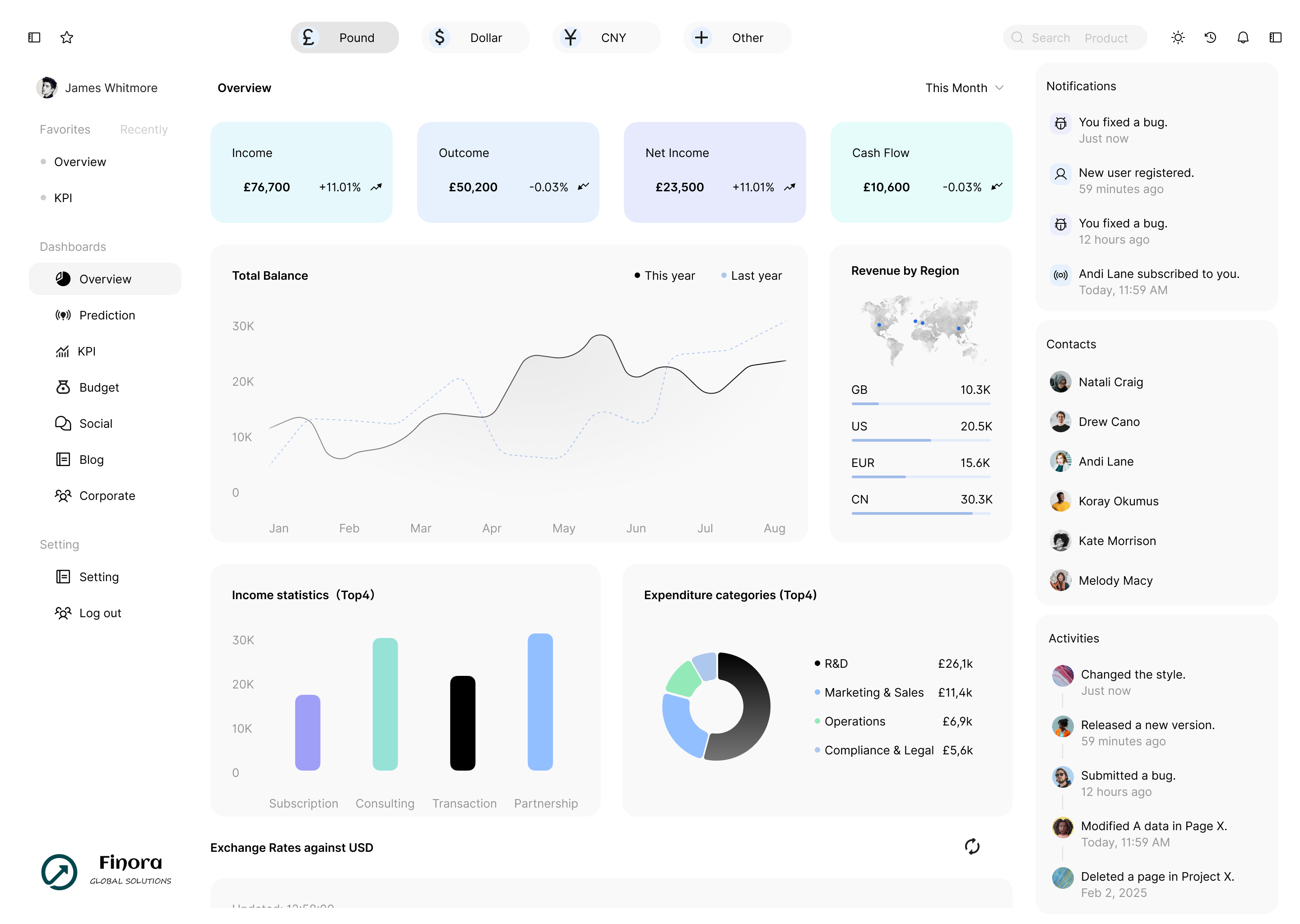
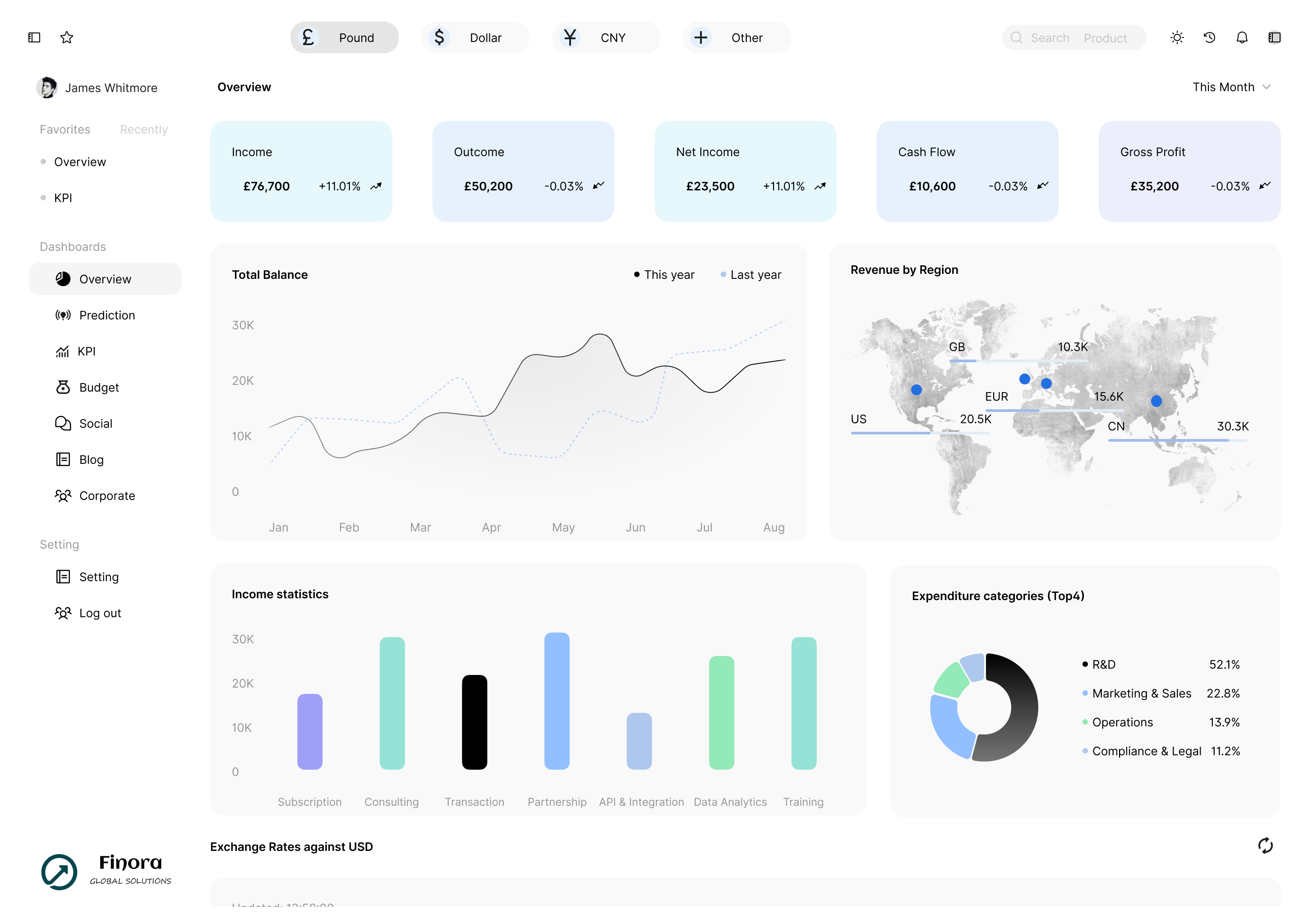
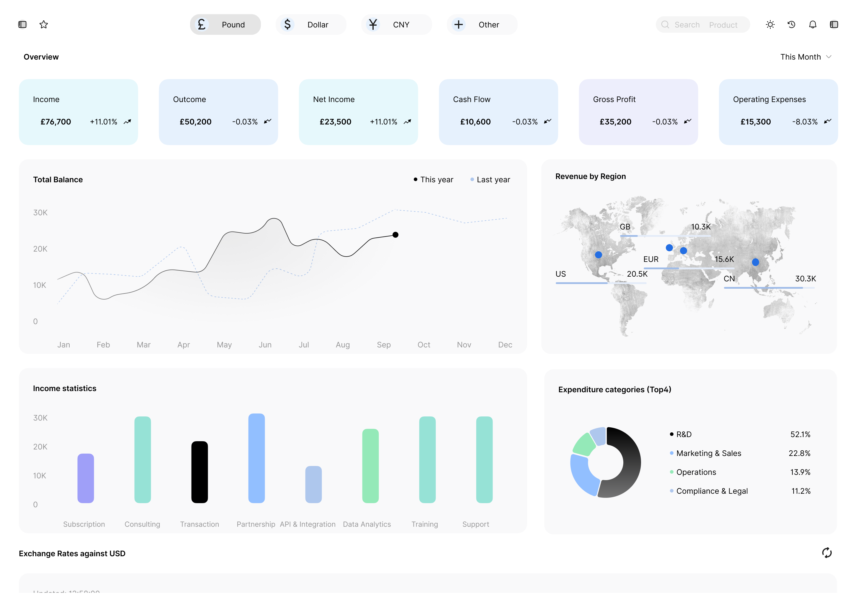
Financial Overall
Trend Metrics
Regional Revenue
Total Balance Trend
Income Statistics
Expenditure Categorie
Exchange Rates
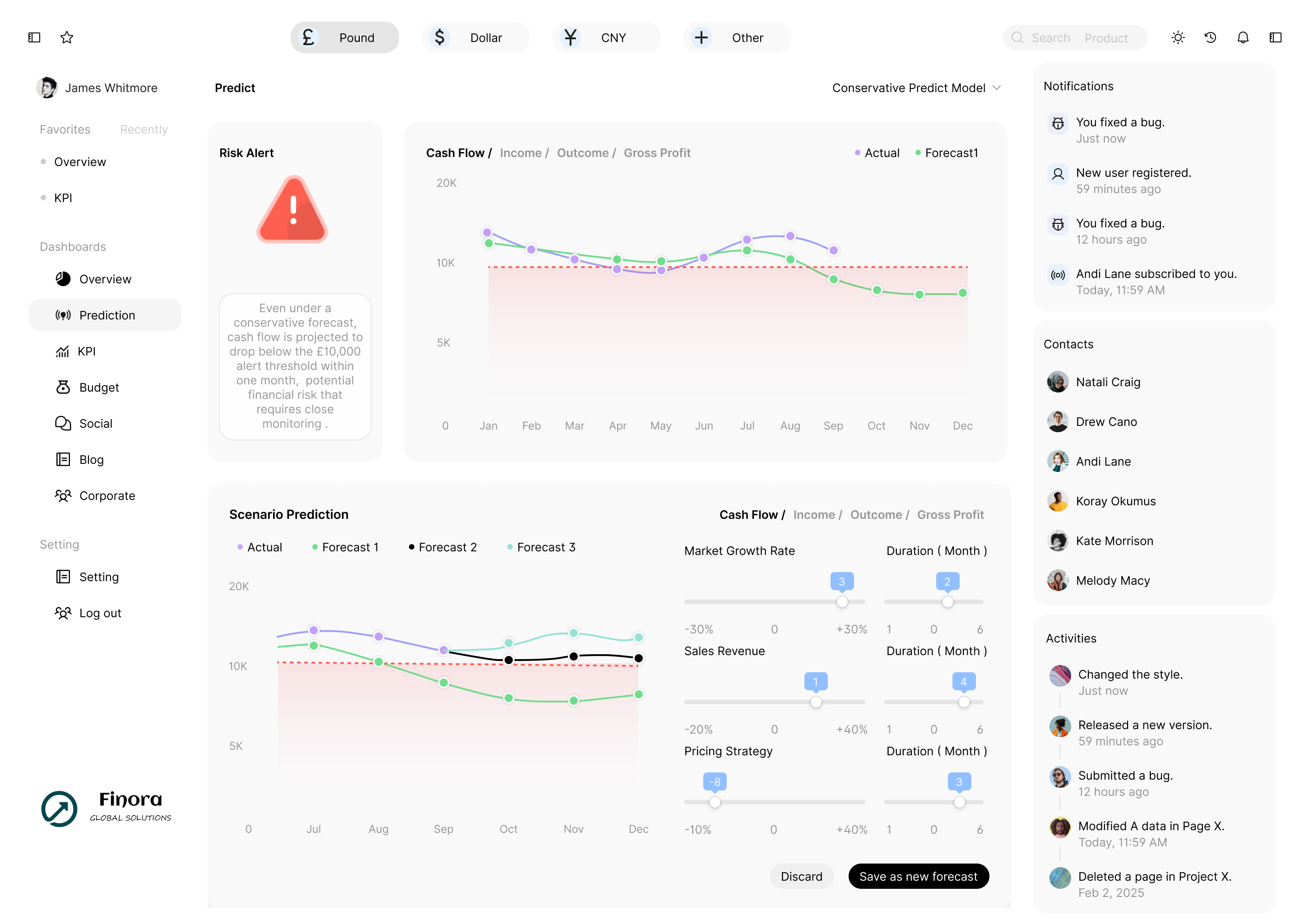
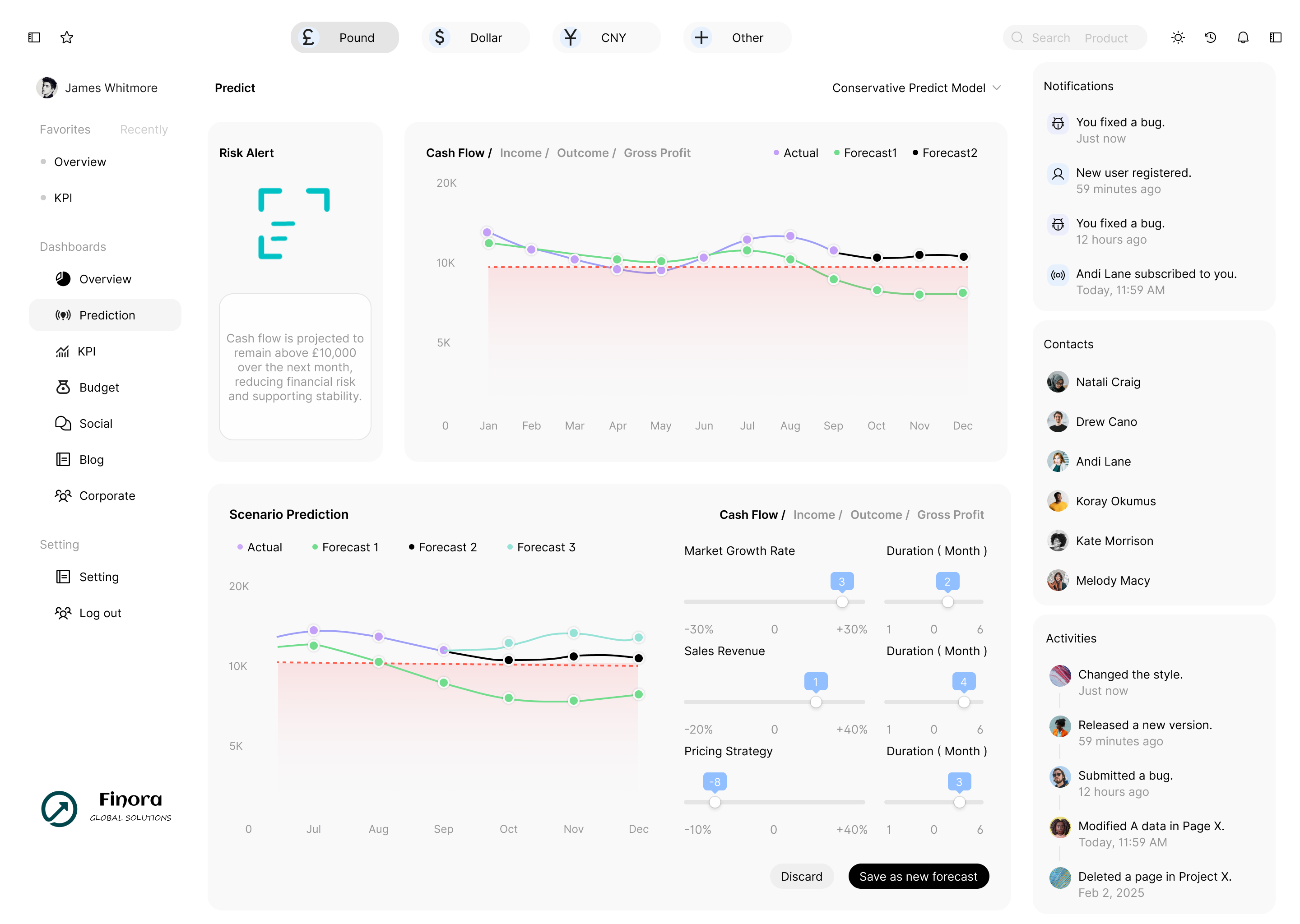
Prediction
Global Header
Sidebar Navigation
Right Sidebar Widgets
Risk Alert
Predict Model
Predict Graph
Scenario Analysis
Scenario Select
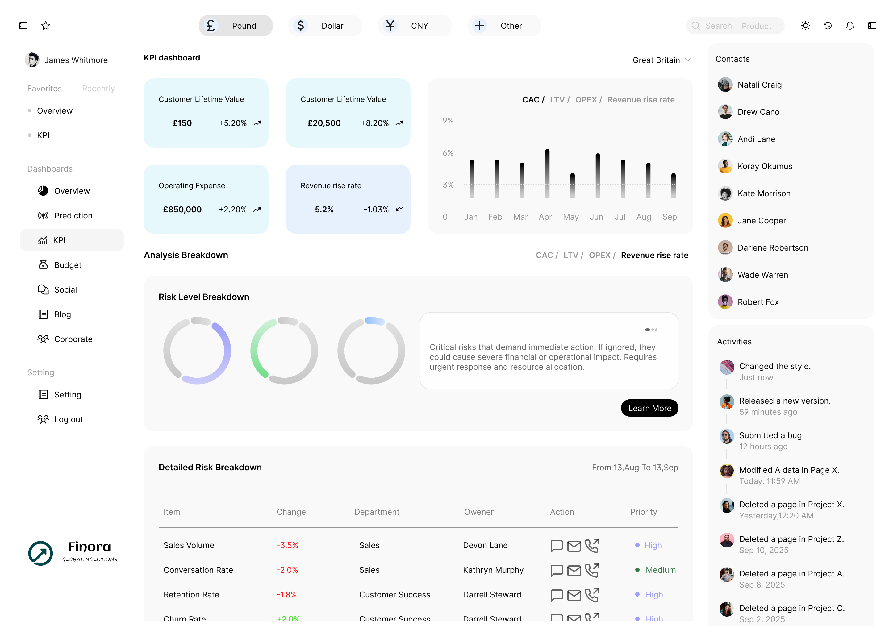
KPI
Global Header
Sidebar Navigation
Right Sidebar Widgets
KPI Summary Cards
KPI Trend Chart
Analysis Breakdown
Detailed Risk Breakdown
Contact Responsible Manager
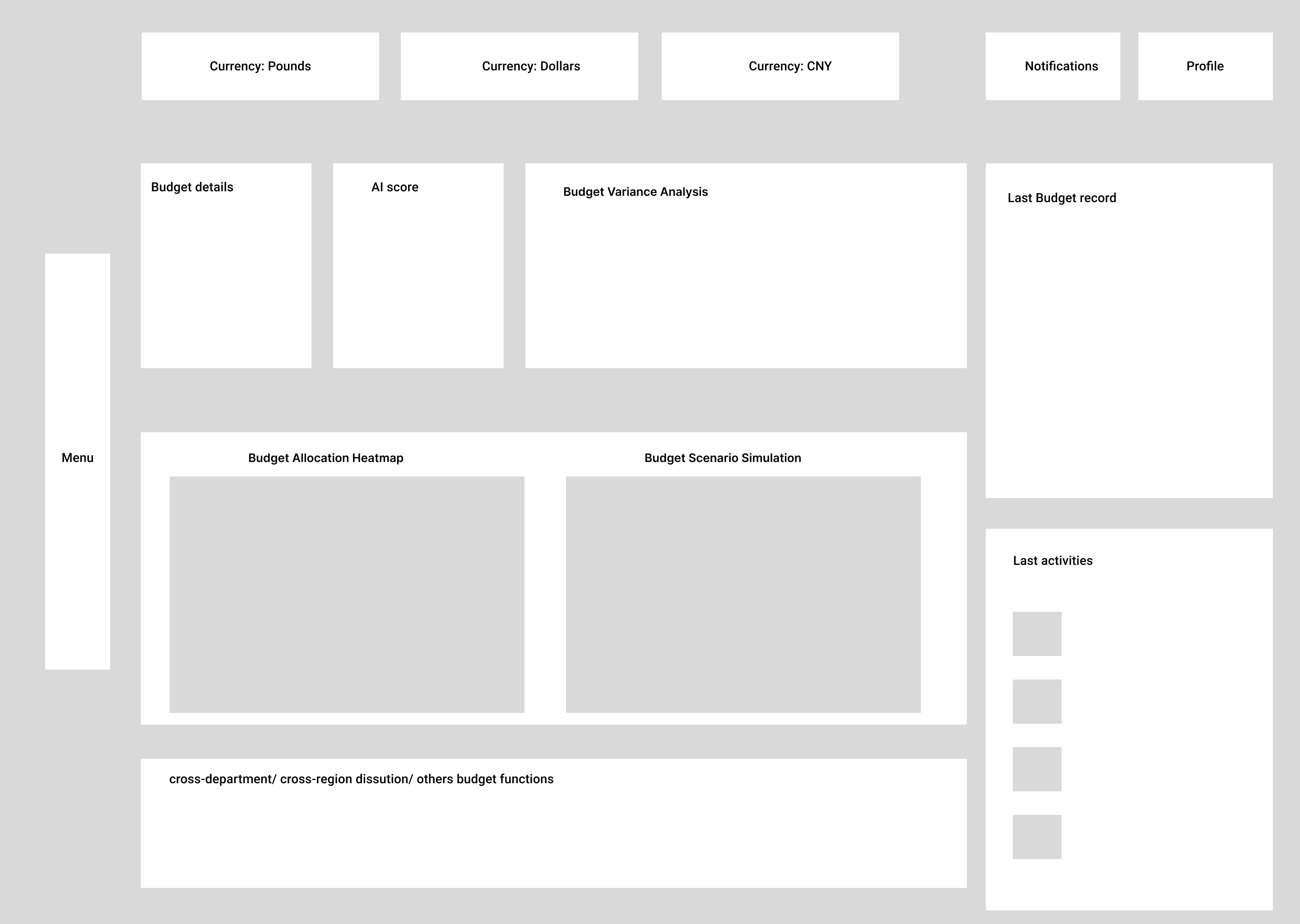
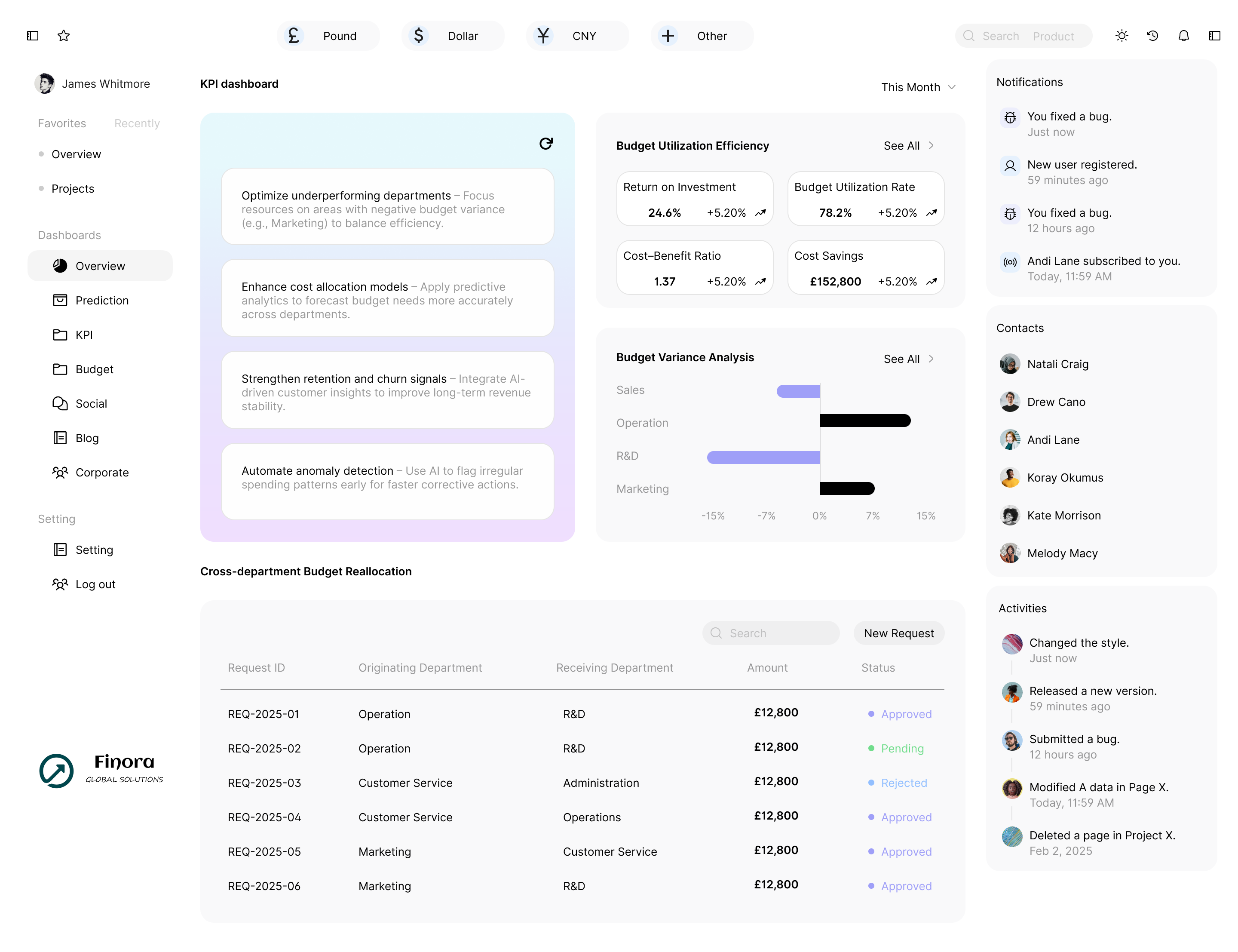
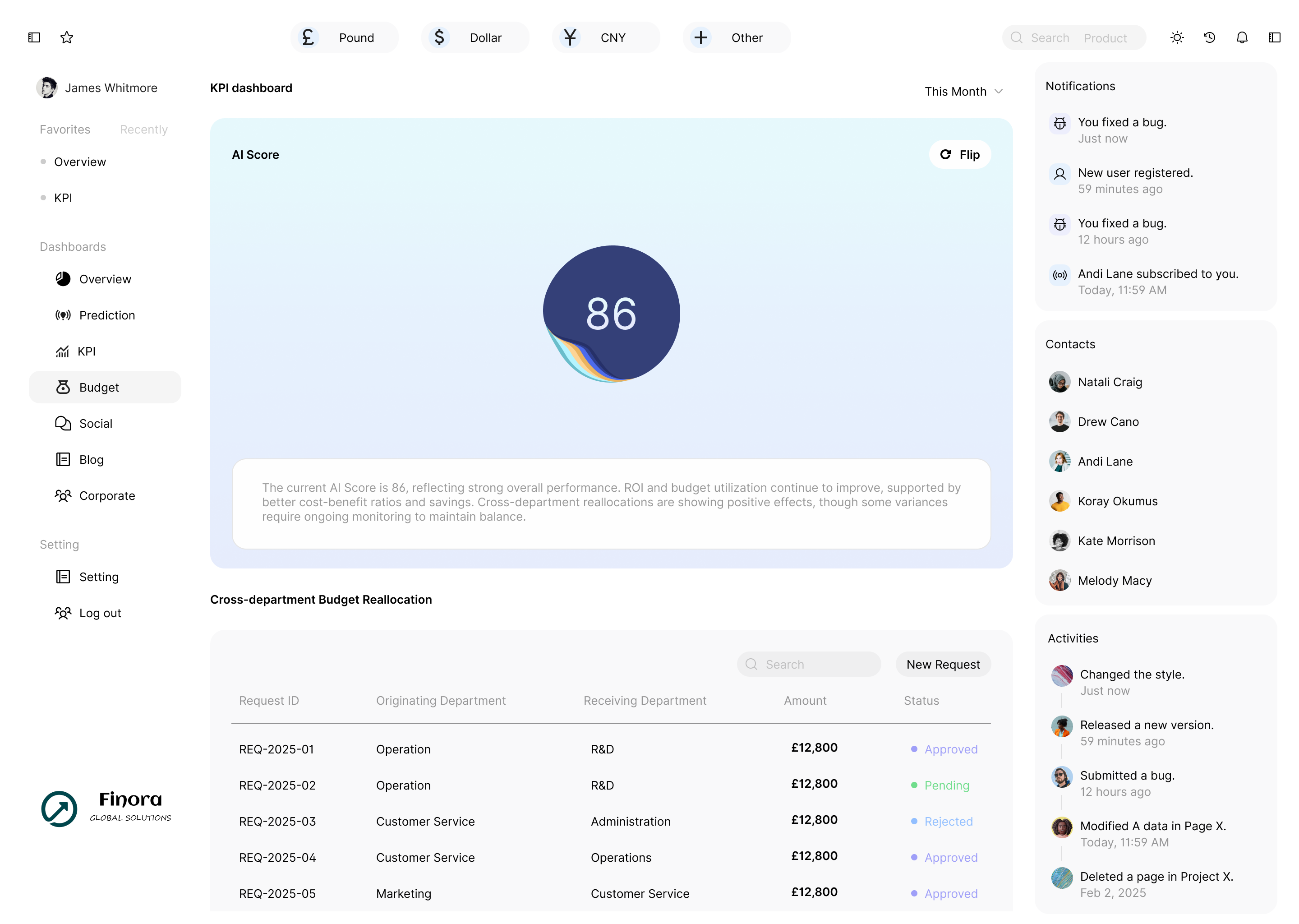
Budget
Global Header
Sidebar Navigation
Right Sidebar Widgets
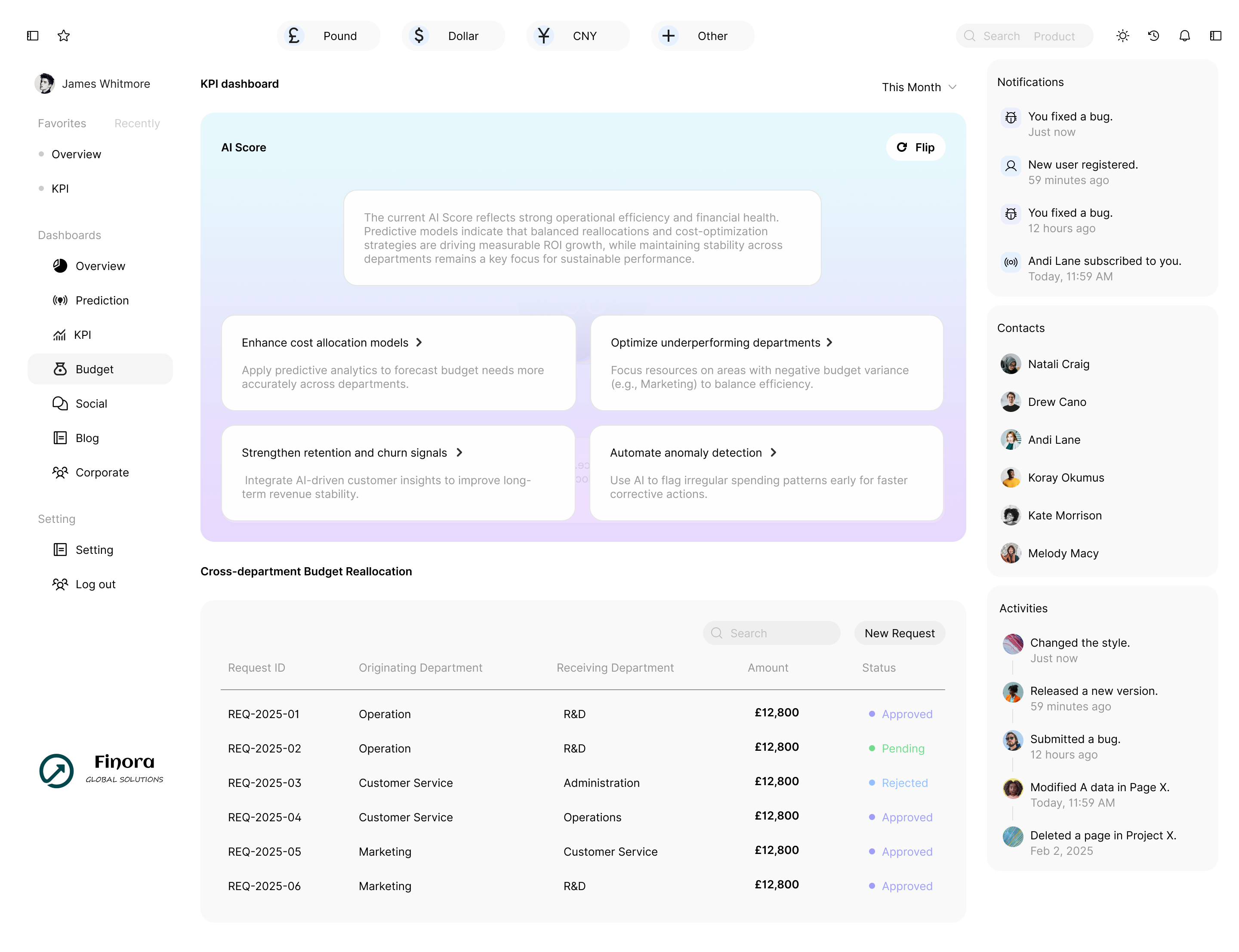
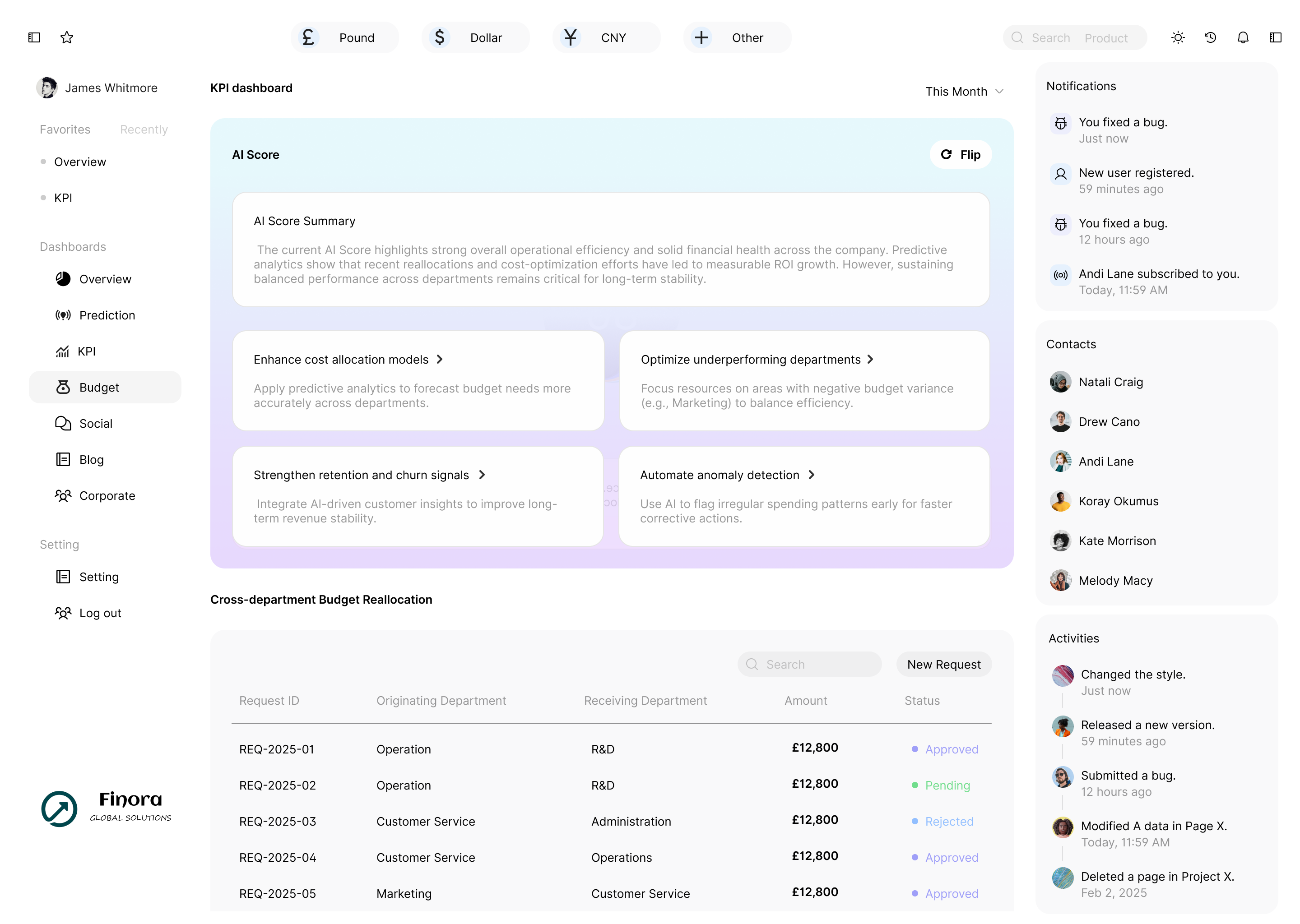
AI Score
Ai Suggestion
Budget Related Graph
Budget reallocation
Low-fi Prototype
I created low-fidelity wireframes to explore layouts and user flows, validating the structure and feature priorities before advancing to high-fidelity designs.
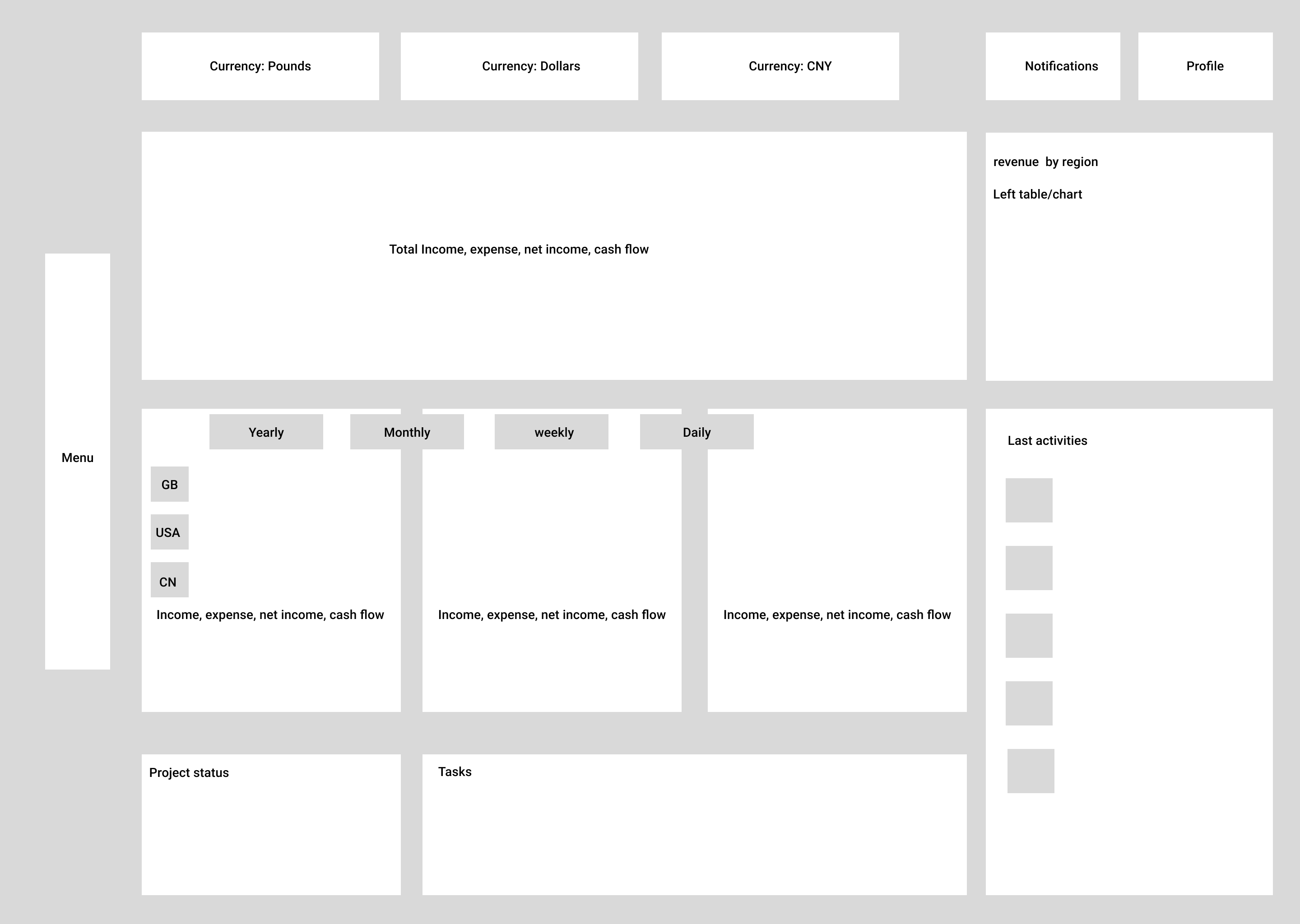
Dashboard low-fi prototype
Prediction low-fi prototype
KPI low-fi prototype
Budget low-fi prototype
Iteration
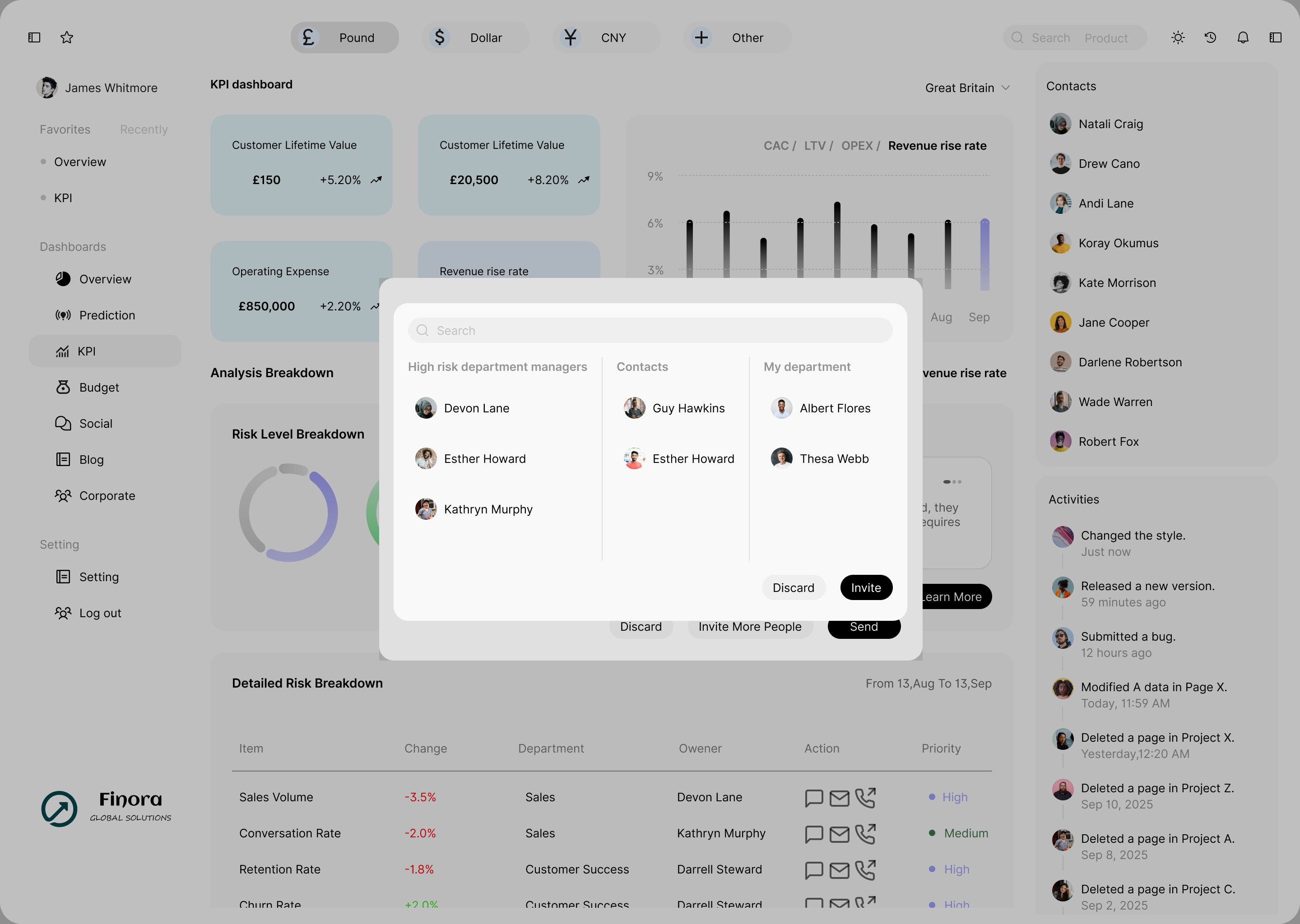
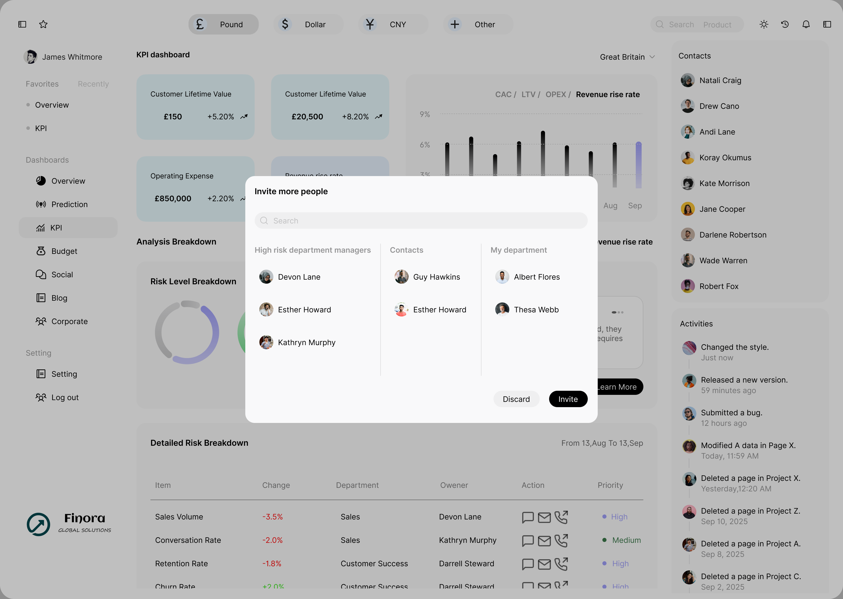
I conducted iterative refinements on key screens through multiple rounds of feedback, progressively enhancing visual hierarchy, optimizing layouts for readability, and adding contextual elements to improve usability and alignment with user needs.
Added residual background elements from the previous step, enhanced the avatar, and optimized the padding.. Optimized the ‘frame-in-frame’ structure, added local headings to improve recognizability, and further refined the padding
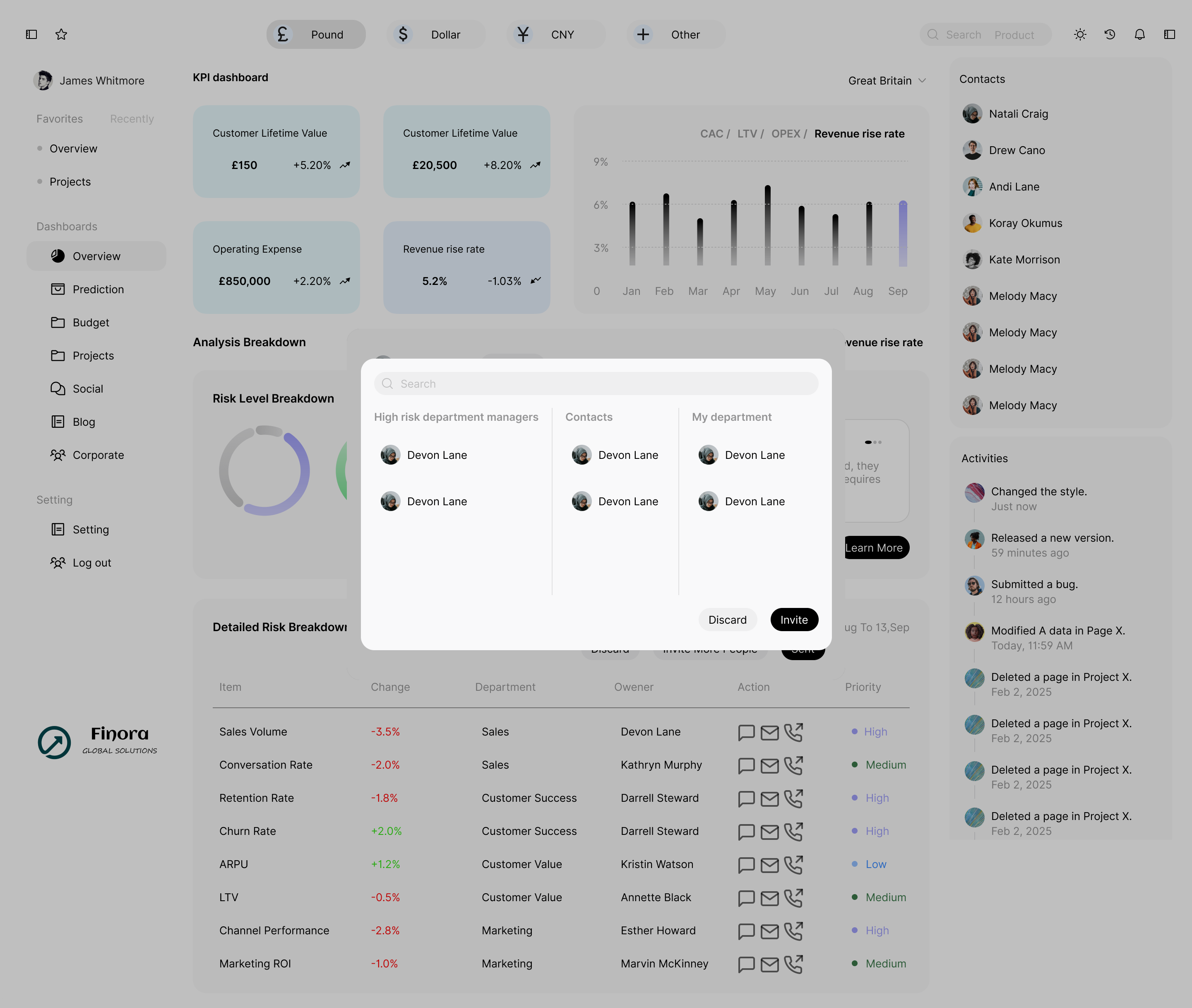


KPI prototype
Merged the cards, structured the content using a top-down (general-to-specific) approach, and arranged the corresponding functionalities.”Reworked the card format to create a more cohesive overall look and a smoother structural flow.


Budget prototype
Design System
I created a design system to ensure visual consistency, efficiency, and scalability across all interfaces.
Color Palette
Card Backgrounds
income
#e6f8fc
outcome
#e6f1fd
netIncome
#e6eafc
cashFlow
#e6fcfa
Chart Colors
purple
#9f9ff8
teal
#96e2d6
blue
#92bfff
green
#94e9b8
Typography
Font Sizes
xs (8px)
Sample text
sm (13px)
Sample text
md (18px)
Sample text
Headings
Heading 1
28px / bold
Heading 2
20px / bold
Heading 3
16px / bold
Data Visualization
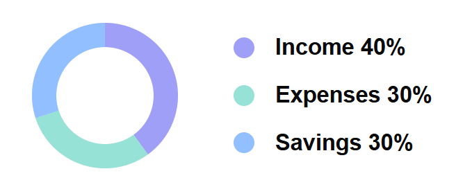
Income 40%
Expenses 30%
Savings 30%
Text Colors
Primary
#000000
Sample
Secondary
rgba(0,0,0,0.4)
Sample
Components
Stat Cards
Income
£76,700
+11.01%

Outcome
£50,200
-0.03%

Net Income
£23,500
+11.01%
Cash Flow
£10,600
-0.03%
Buttons
Primary
Secondary
Hover
Disabled
Border Radius
8px
10px
12px
16px
Spacing, Shadows & Icons
Shadow Levels
Small
sm
Med
md
Large
lg
Icon System

up

down

chart

filter
Spacing Scale
4px
8px
12px
16px
24px
32px
I designed four core interaction flows—Central Dashboard, Predictive Insights, KPI Tracking, and AI-based Score to meet different roles need.
Interaction Flow
Central Dashboard
Provides a real-time overview of key financial metrics in one centralized view.
Predictive Insights
Uses historical data to forecast trends and highlight potential financial risks.
KPI Tracking
Consolidates core KPIs to support faster, data-driven decision-making.
AI-driven Score
Summarizes financial performance into a single, easy-to-understand intelligence score.
Hi-fi Prototype
Dashboard hi-fi prototype

Prediction hi-fi prototype
KPI hi-fi prototype

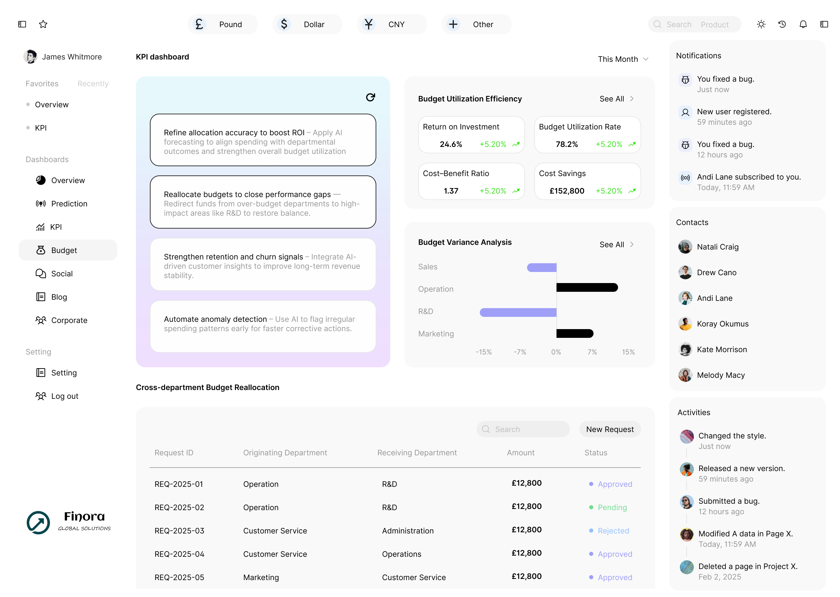
Budget hi-fi prototype
Self-reflection
Through user research and persona analysis, key pain points across Finora’s finance team were synthesized into five core insights.
These insights bridge the gap between user needs and design strategy — transforming research findings into actionable design opportunities that guided the creation of the dashboard’s core functions and value propositions.
View Last Case Study
View Next Case Study