Zhuoqun Yuan
September 10, 2024
Green Budgeter
A concise and usaful budget app for new budgeter.
Industry
FinTech
Responsibility
End-to-end Designer
Duration
8 Weeks
Design for new budgeter
Green Budget helps users build healthy money habits, reach savings goals, and avoid running out of cash. From first-time budgeters to students and new employees, it offers smart tools like expense tracking, savings targets, spending alerts, and daily allowances. Success is measured by reduced overspending, goal completion, and end-of-cycle balances.
Problem & Solutions
- People often overspend on snacks and shopping because tracking expenses feels overwhelming, leaving them unprepared for emergencies.
- Self-funded students struggle to save from daily spending, making it hard to reach future goals like travel.
- Newly employed users find it hard to balance daily expenses and loan payments, with little left to save before payday.
✓Track & Save
Green Budget helps reduce
unnecessary spending and build
savings through simple expense
tracking.
✓Hit Saving Goals
Automate loan payments and
calculate daily limits to avoid running
out of money.
✓Manage Daily Budget
Set income-based goals, get
reminders, and pause non-essential
spending to save more.
Design Process
I followed a human-centered design process, moving through the five steps.
Empathize
Define
Ideate
Prototype
Test
Quantitative Research
I interviewed several new budgeters—people who are new to managing their own money—to understand their budgeting needs and personal financial habits.
Observations
60%
Insightful and practical analytics
30%
Assisted by AI and innovative tools
80%
Savings progress visualization
90%
Need a concise and easy featured budget app.
50%
Engaging and supportive user community
User Persona
I synthesized this persona from user research and used it to guide feature prioritization and design decisions throughout the project.

Nuan
International student
About


25


Sheffield,the UK

MEd

Student
Description
Nuan is an international student learning to manage her own finances. She wants to save for travel but often overspends on daily expenses. She needs a simple app to track spending, stay on budget, and reach her savings goal.
Goals
- Would like to track expenses.
- Want to remind budget and plan for unexpected enpenses.
- Want a easy and concise app to show how much can spend each day.
Pain points
- She has no target saving goals so cant stop buying foods or shopping online.
- She has no concept of how much could spend each day.
- She always ask parents for extra money for emergencies.
"Such a good feeling with start to manage money, and I wanna save enough to go to Jersey Island."


Empathy map
I used this empathy map to translate research findings into a clear understanding of users’ needs, motivations, and emotions.
Says
- ‘I’d love an app that reminds me of my budget and helps me plan for unexpected expenses.’
- ‘’I don’t have a fixed amount. If I have extra money left at the end of the month, I transfer it to my savings account.’’
Thinks
- Would like to track expense.
- Warn users automatically when spend too much.
- Showing progress of saving
- Want to balance debt payment and saving goal without broke
Does
- International students
- Limited income from family support
- Entry-level employee
- Living pay-check
- Local student
- Working part-time jobs
- paying off student loans
Feels
- Excited when achieve the goals with my effect.
- Sad for unexpected expense.
- Worried for not enough money for next paycheck.
- Fulfilling with saving growth
- Happy to buy objective with my saving
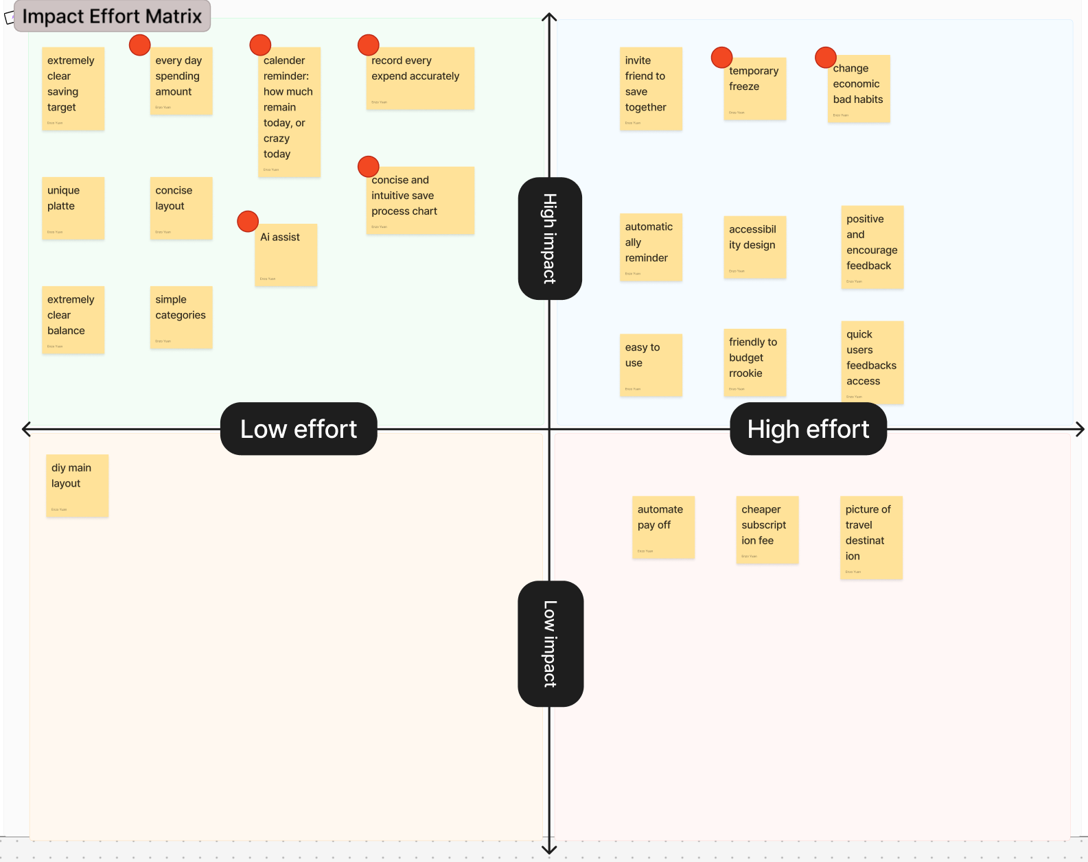
Impact Effort Matrix
I used an Impact–Effort Matrix to prioritize ideas by balancing user value and implementation effort, helping me identify high-impact, low-effort features to focus on first.
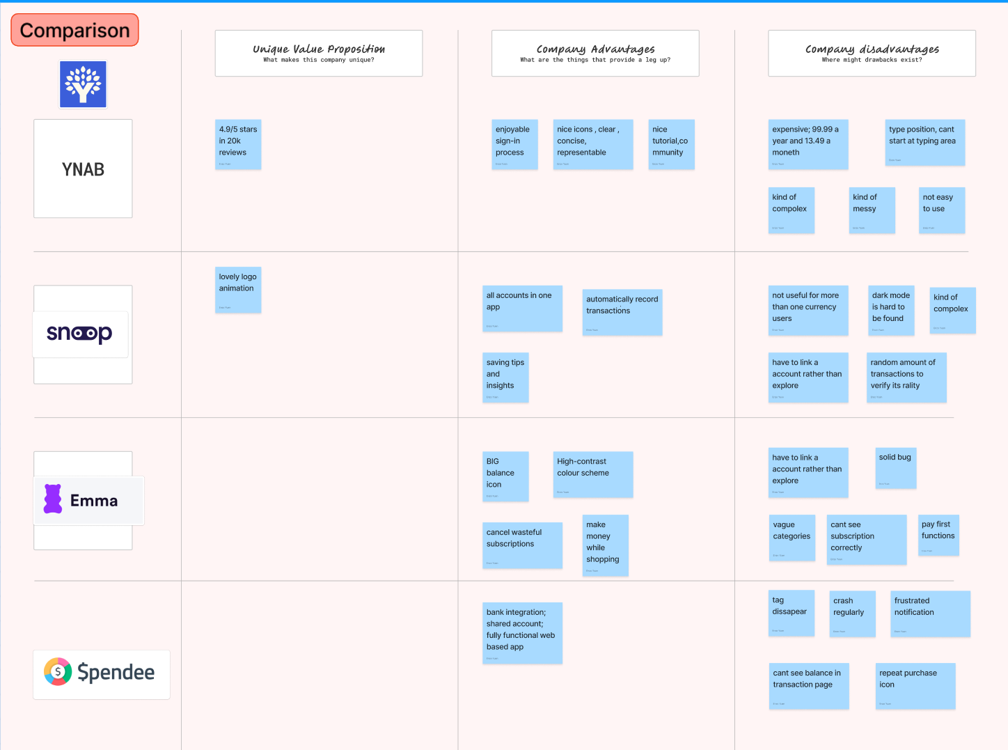
Competitive Audit Analysis
I conducted a competitive audit to compare existing budgeting apps and identify strengths, weaknesses, and gaps in the market, helping inform feature opportunities and differentiation for my design.
Information architecture
Based on earlier research, I organized the information architecture into clear, goal-oriented sections to help users easily track spending, manage savings, and review insights.
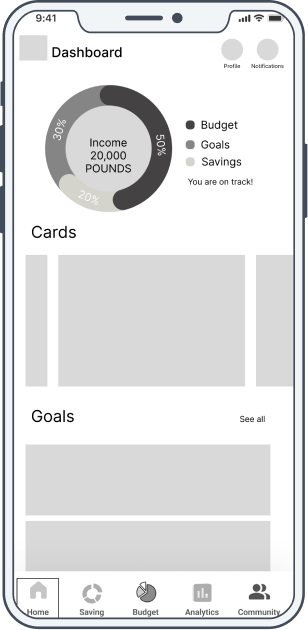
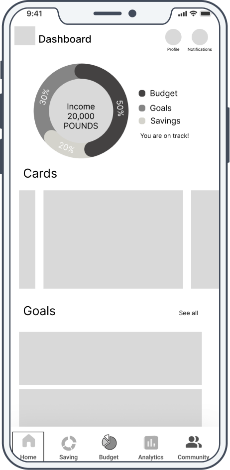
Home
•Profile
•Balance
•Card
•Transactions
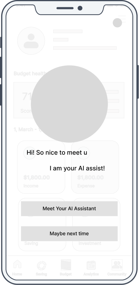
•AI function
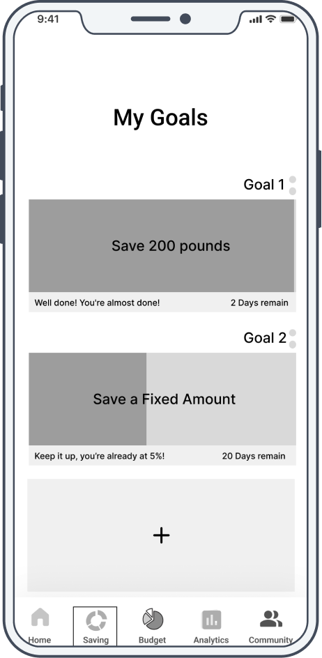
Saving
•Saving list
•Saving details
•Add new saving
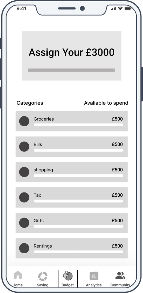
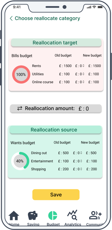
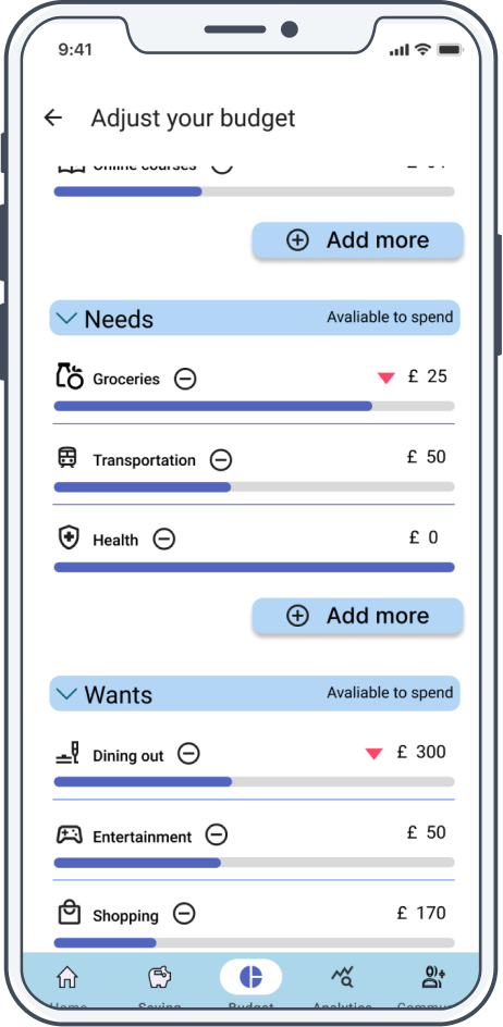
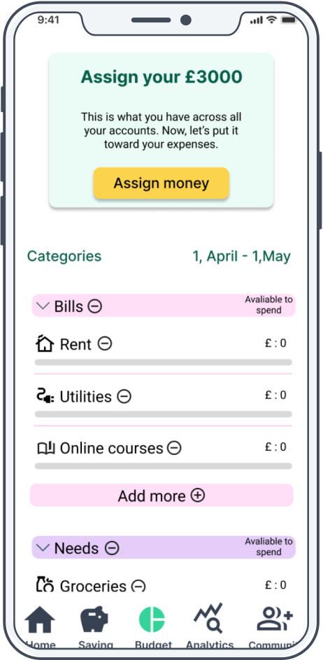
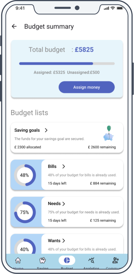
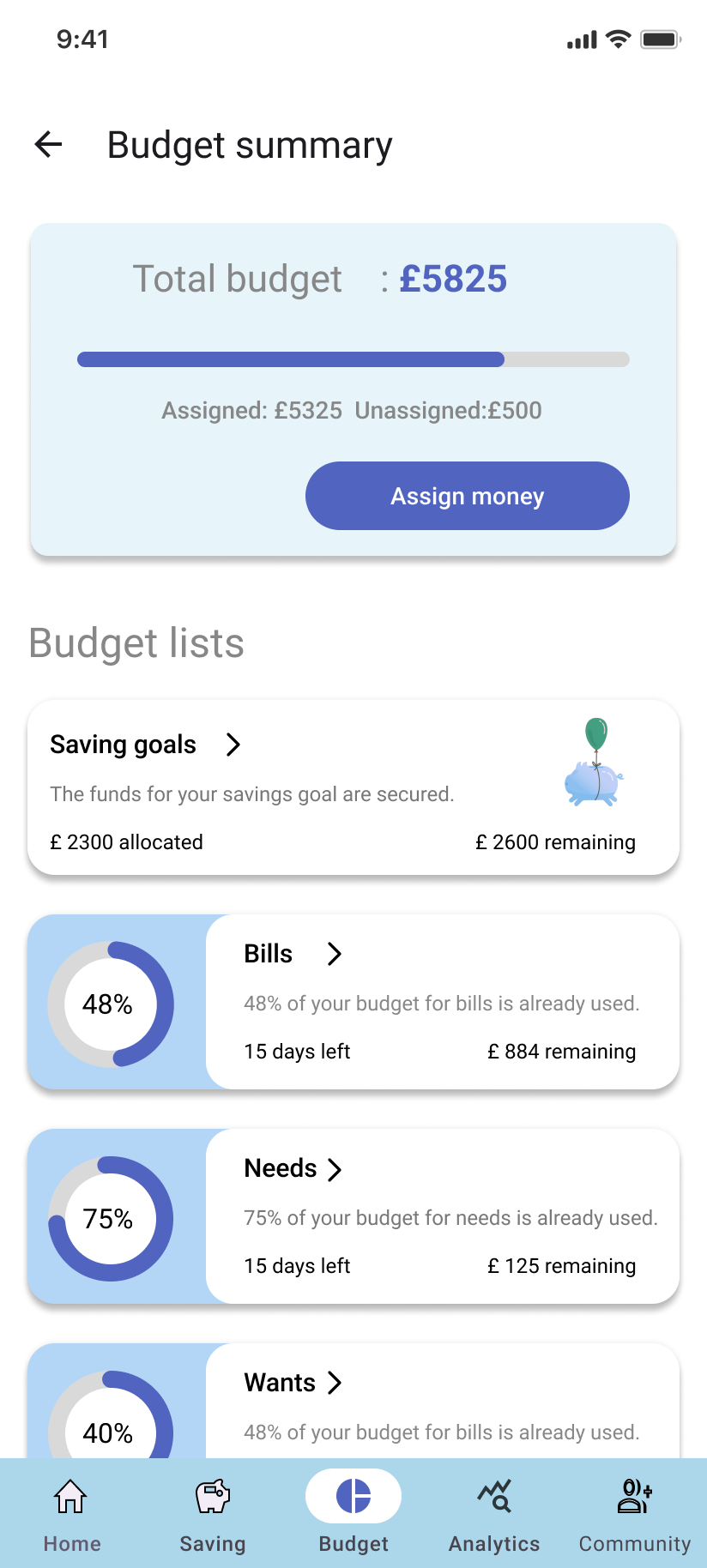
Budget
•Total budget
•Budget list
•Budget details
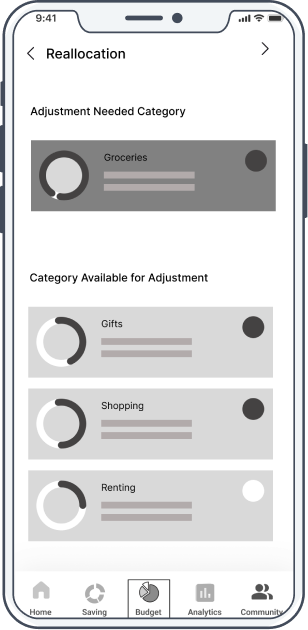
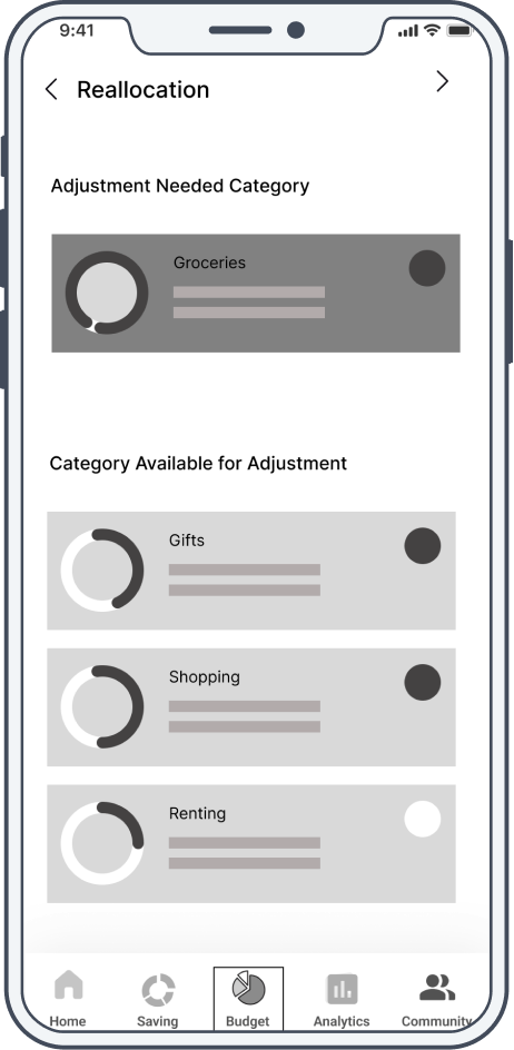
•Adjust budget
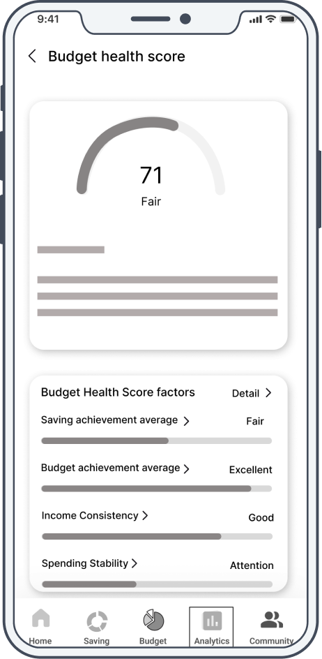
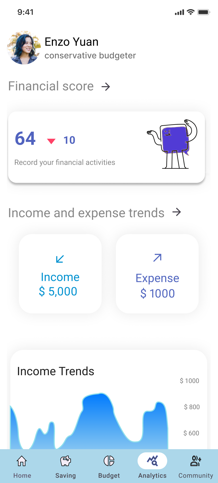
Analytics
•Financial score
•Outcome trend
•Income trend
•Score details
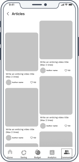
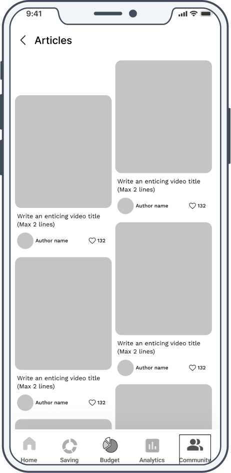
Community
•Posts
•Articles
•Videos
Sketches
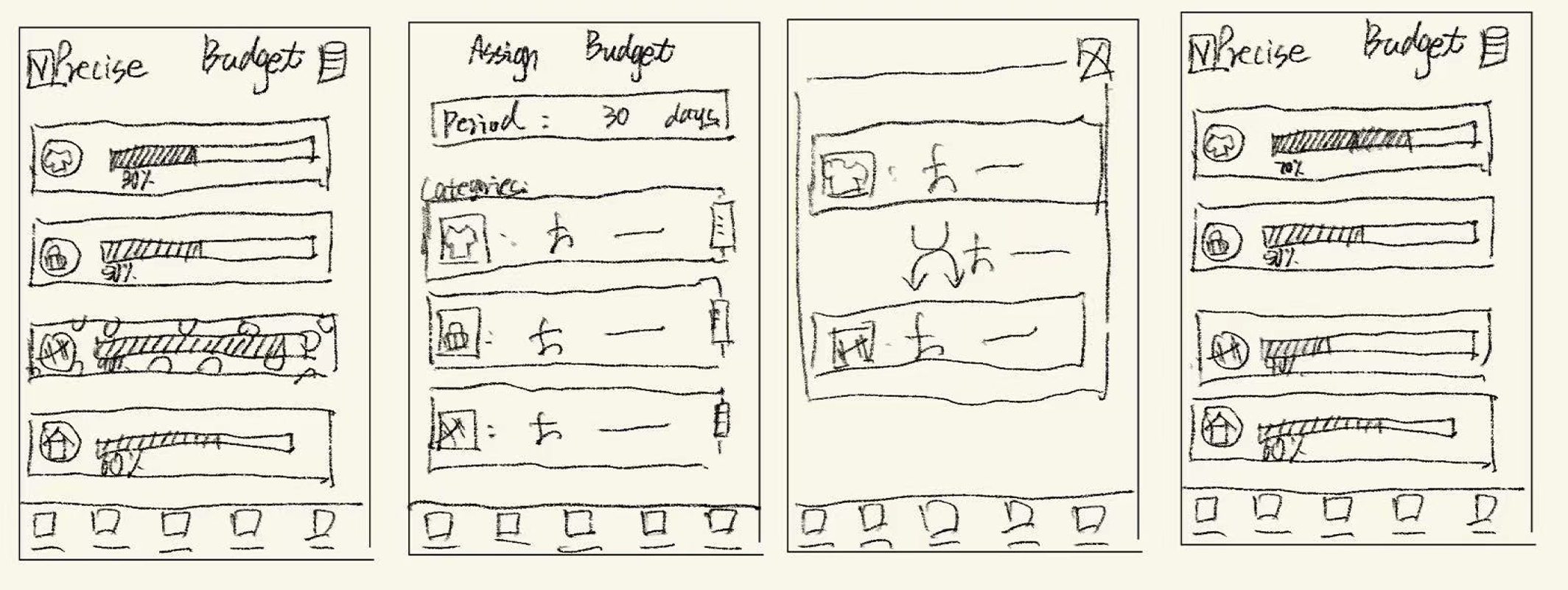
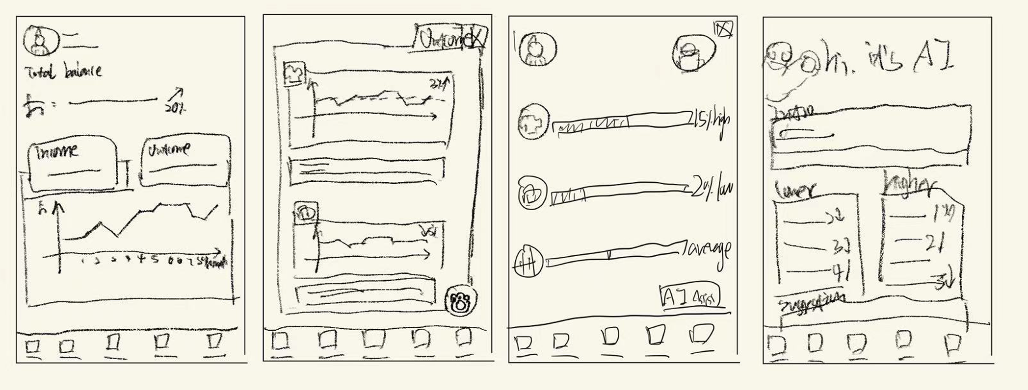
Based on earlier research and information architecture, I sketched key feature flows to quickly explore layouts, interactions, and user journeys before low-fidelity design.
Saving feature flow
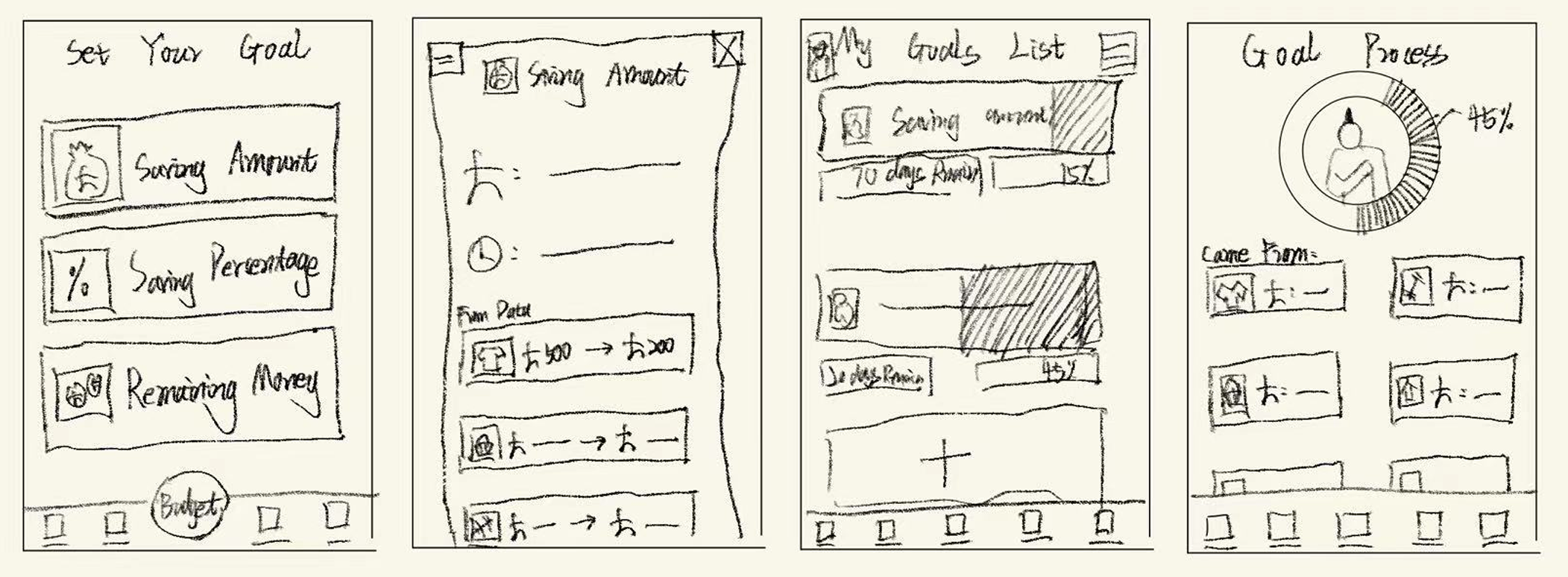
Budget feature flow
Analytics feature flow
Low-fi prototype
Based on the earlier sketches, I created low-fidelity prototypes to validate layout, user flows, and core interactions before moving into high-fidelity design.


Usability test
I used unmoderated usability testing with Maze to evaluate the low-fi and early hi-fi prototypes. The results showed strong task completion and satisfaction, while identifying issues in clarity and visual hierarchy that guided further design improvements.
Test result


75% of participants were satisfied with the functionality of the low-fidelity prototype
75%

60% of participants said they would consider subscribing to the full version of the app.
60%

80% of participants successfully completed the task during the unmoderated usability test.
80%
Confusion
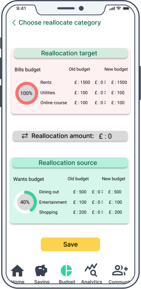
Nearly half of the participants felt confused about the budget reallocation feature, with some getting lost during the process.
Clarity
The card layout makes it visually difficult to distinguish between categories, and the color scheme can be disorienting.
Hierarchy
Some features appear visually cluttered, making it difficult to distinguish between primary and secondary elements.
Iteration
Based on usability testing insights, I iterated on key flows to improve clarity, guidance, and visual hierarchy.
Confusion → Guidance
→
→
Ambiguity → Clarity
→
→
Flatness → Hierarchy
→
→
Interaction Flow
I designed four core interaction flows—Saving, Budget, Analytics, and AI—to guide users through goal setting, expense tracking, insights, and personalized assistance with clarity and efficiency.
Saving Flow
Use a simple, visual saving flow to help users easily reach their saving goals.
Budget Flow
Use a clear, automated budget to track every expense and its category.
Analytics Flow
Use intelligent AI scoring to optimize spending habits and improve personal financial efficiency.
AI function Flow
Use an AI assistant provides personalized, daily spending recommendations.
The Second Round Usability test
I ran a second round of usability testing to validate the design improvements, which showed higher user satisfaction, strong subscription intent, and improved accessibility.


90% of participants were satisfied with the functionality of the hi-fidelity prototype
90%

80% of participants said they would consider subscribing to the full version of the app.
80%

95% of participants felt the design took their accessibility needs into account.
95%
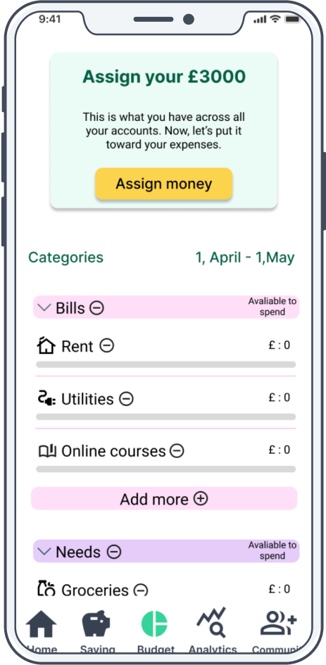
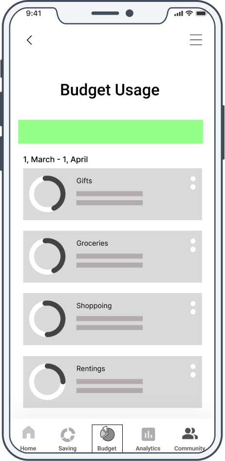
Final Screens
This section showcases the key high-fidelity screens, illustrating core user flows such as budgeting, saving, insights, and AI assistance. It demonstrates how research and iteration were translated into a clear, consistent, and usable final interface
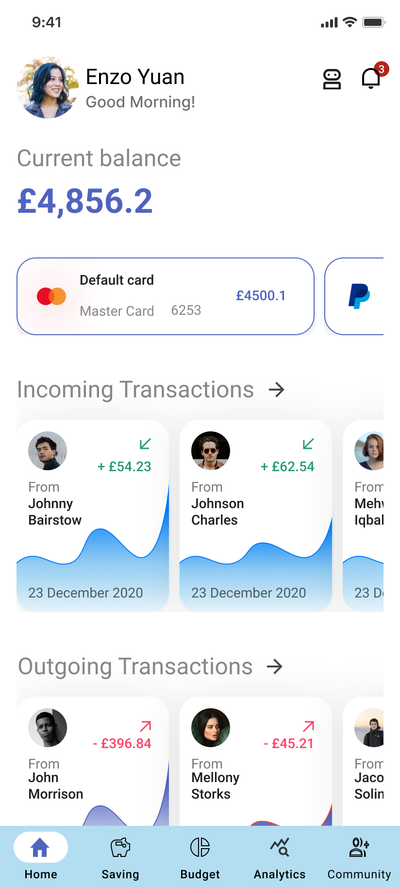
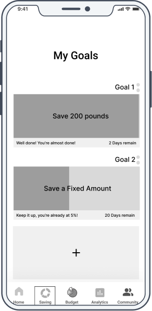
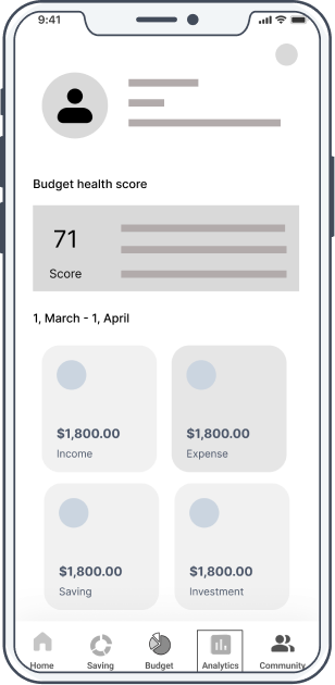
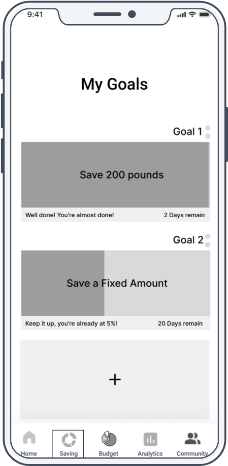
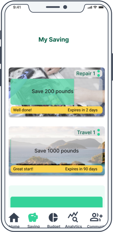
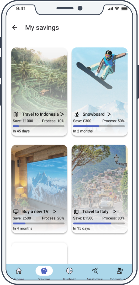
Home page
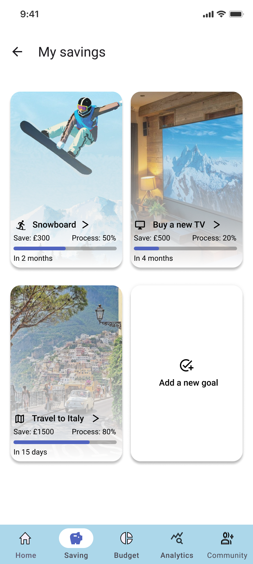
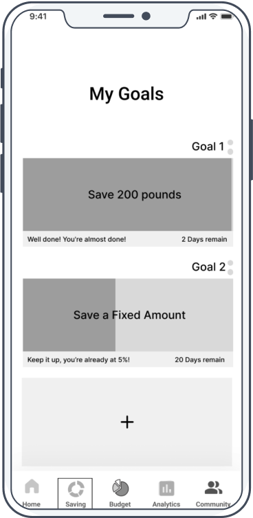
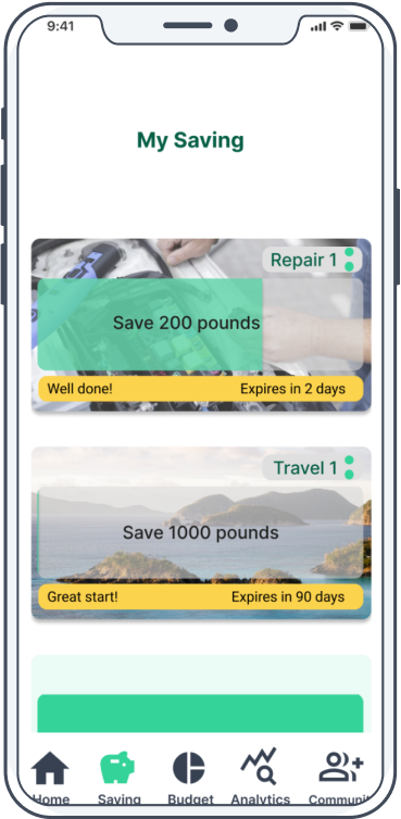
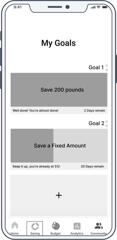
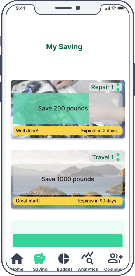
Saving
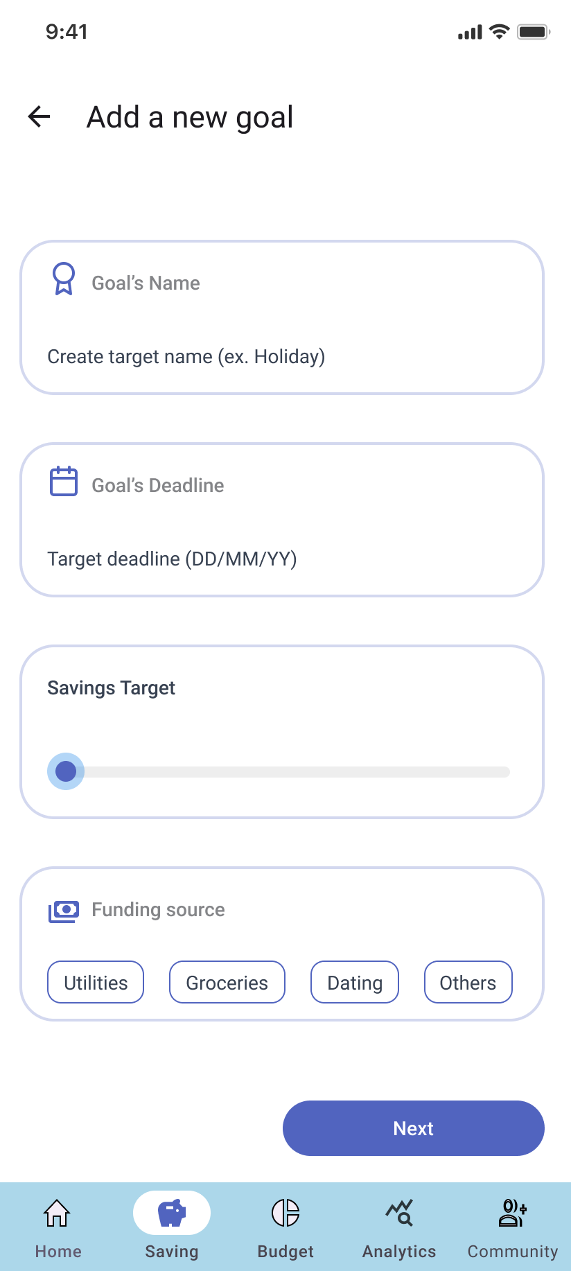
Add new savings
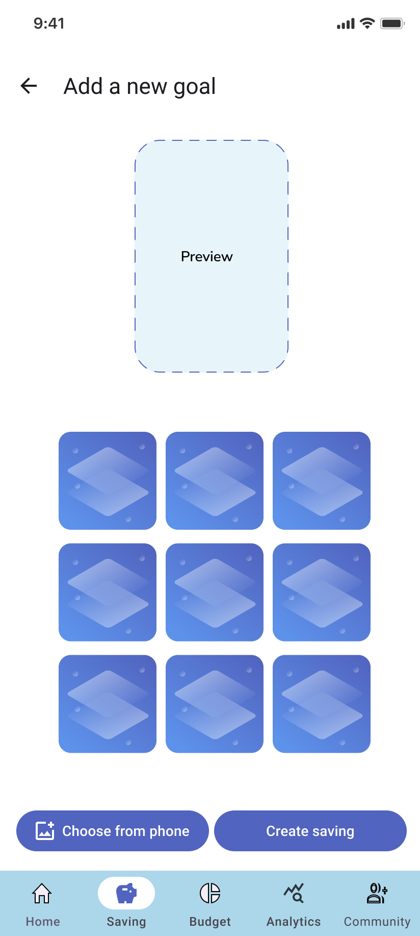
Saving cover page
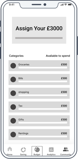
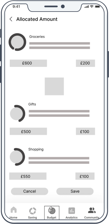
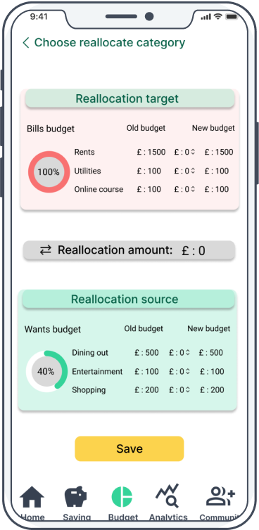
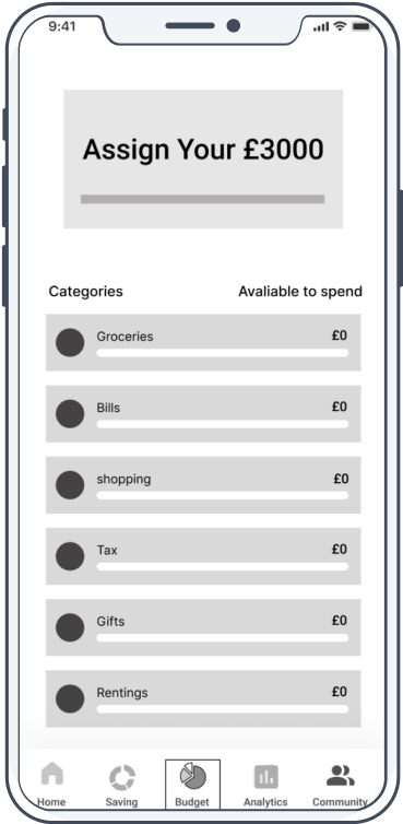
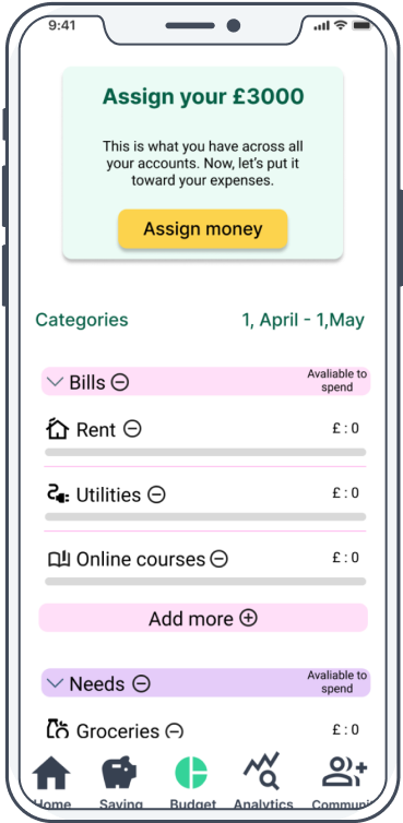
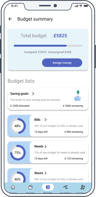
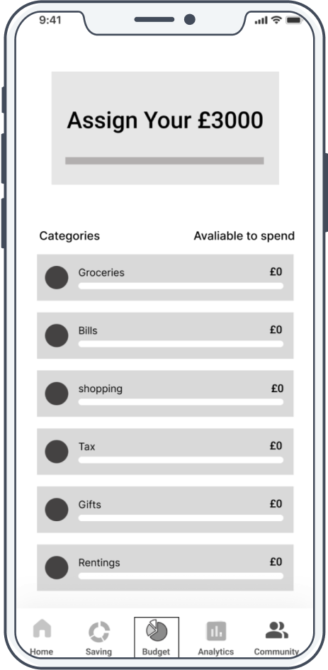
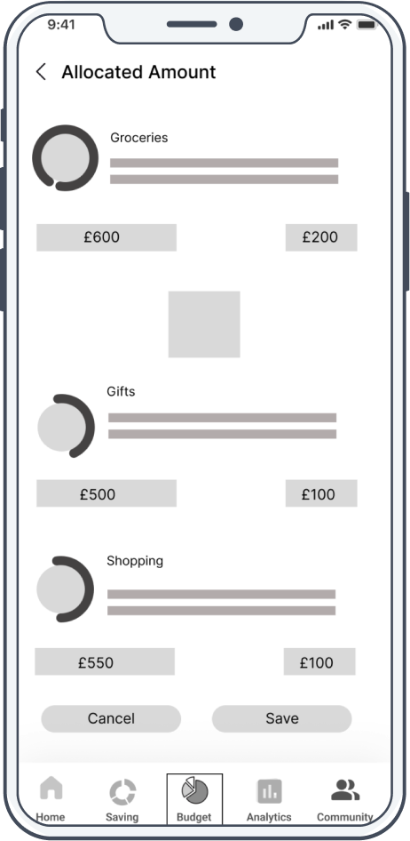
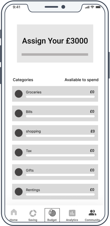
Budget
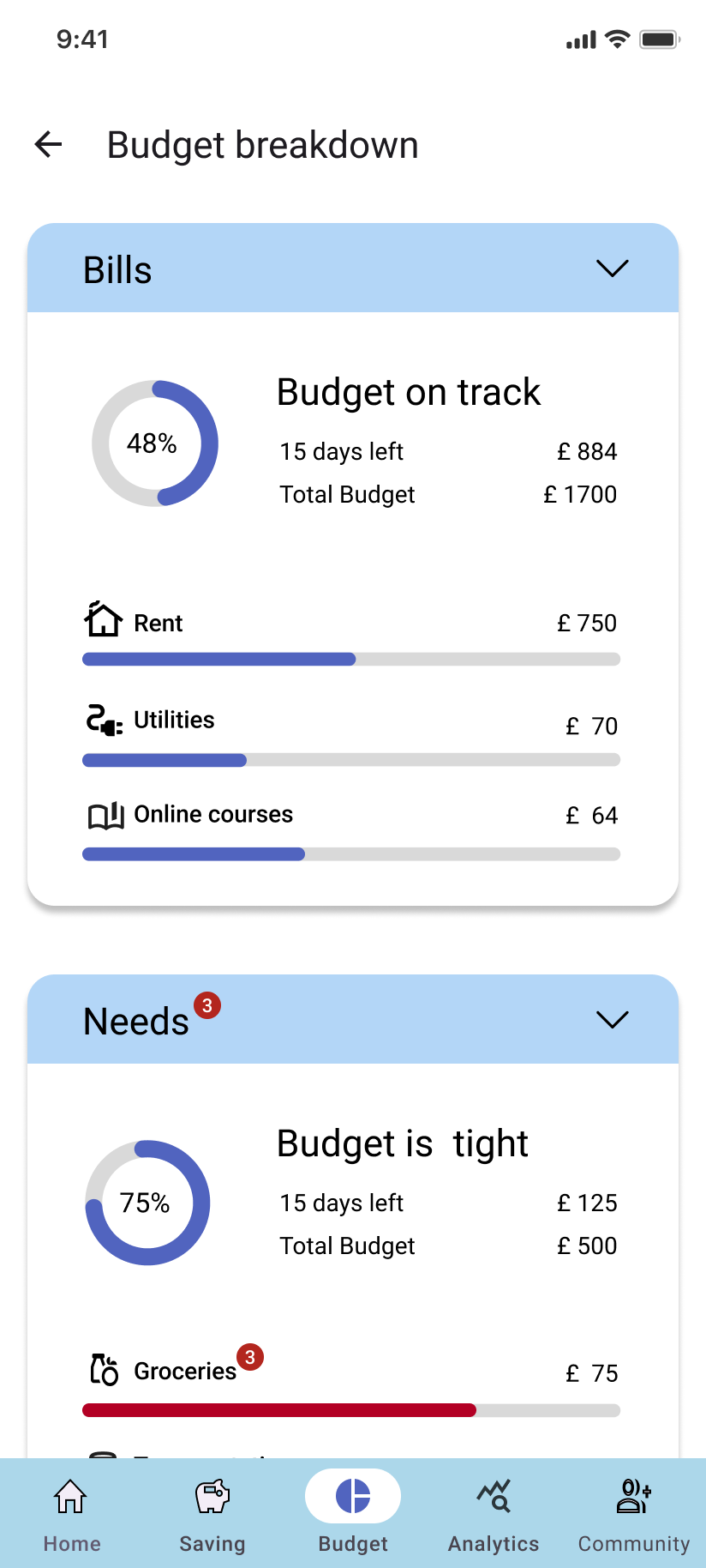
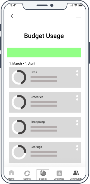
Budget detail
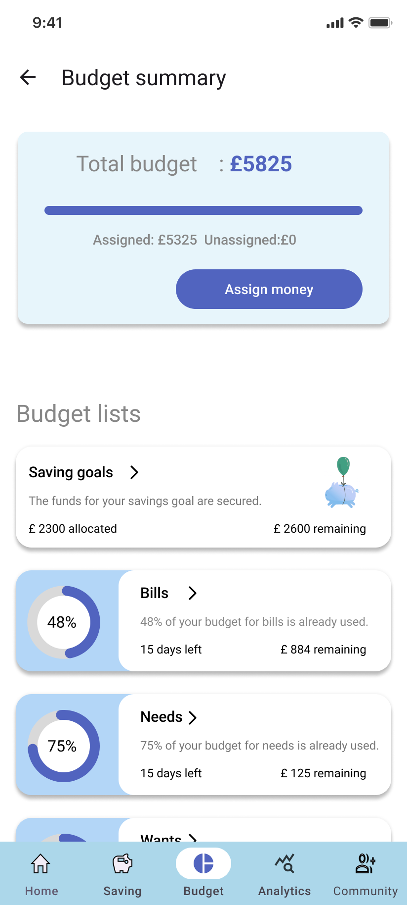
Budget summary
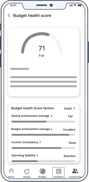
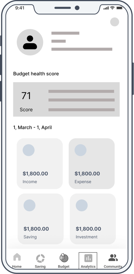
Energy score
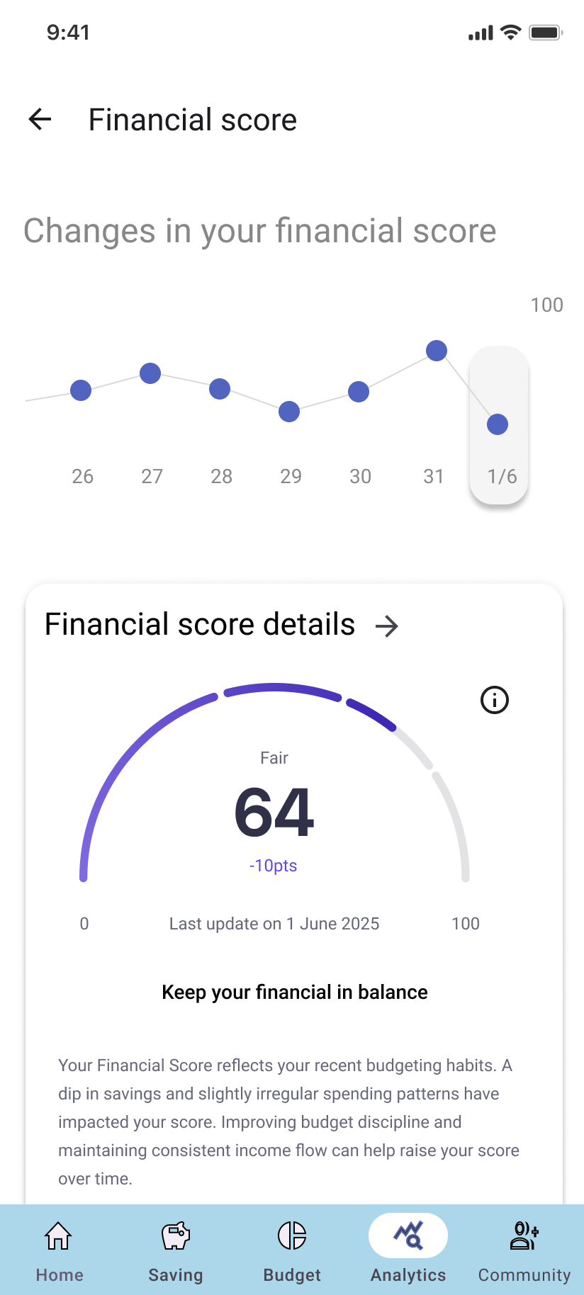
Energy score detail
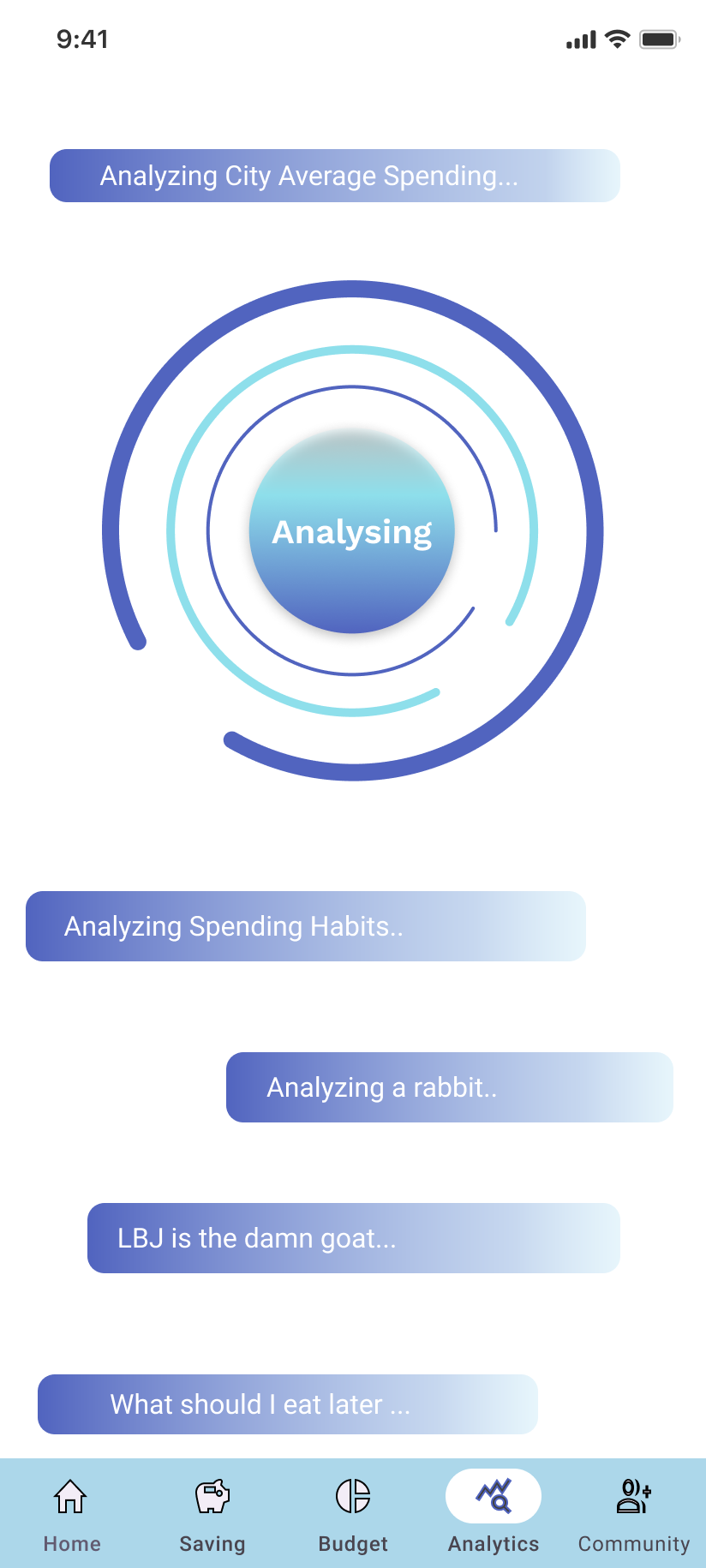
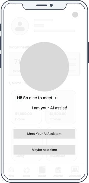
AI assist
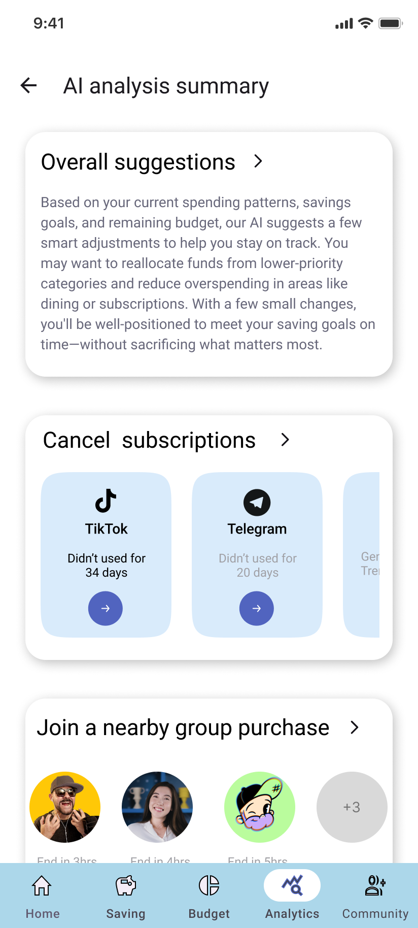
AI suggestions
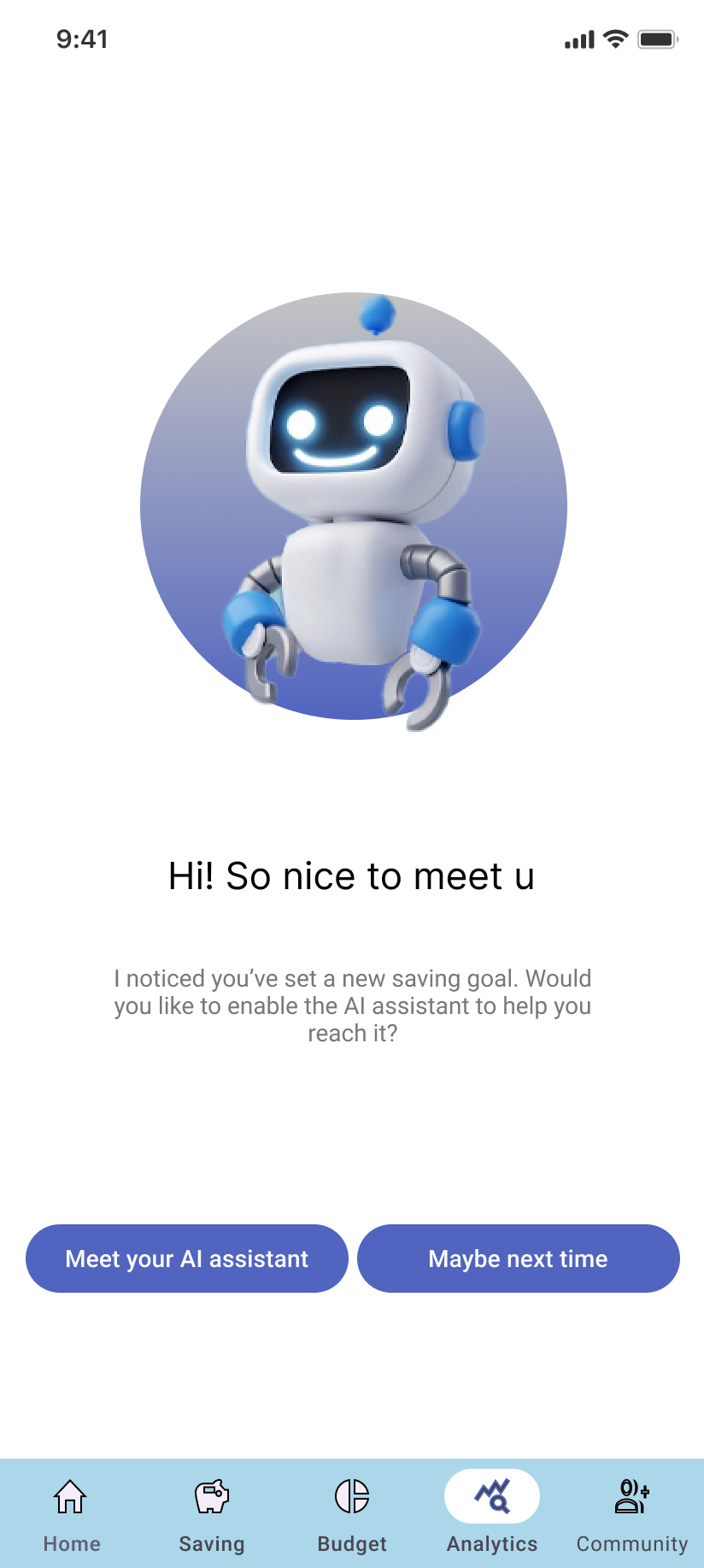
AI function
Self reflection
This was a meaningful project that tackled common challenges faced by first-time budgeters.Throughout the design and implementation process, I strengthened my core UX skills—especially in card-based UI design. I explored how to create diverse card layouts across different screens while maintaining a sense of consistency and visual harmony.
Initially, the design was built around a green color scheme to match the theme. However, considering accessibility concerns—especially red-green color blindness—I eventually switched to a blue palette. This decision deepened my understanding of accessible design and reinforced the importance of inclusive user experiences.
View Last Case Study
View Next Case Study